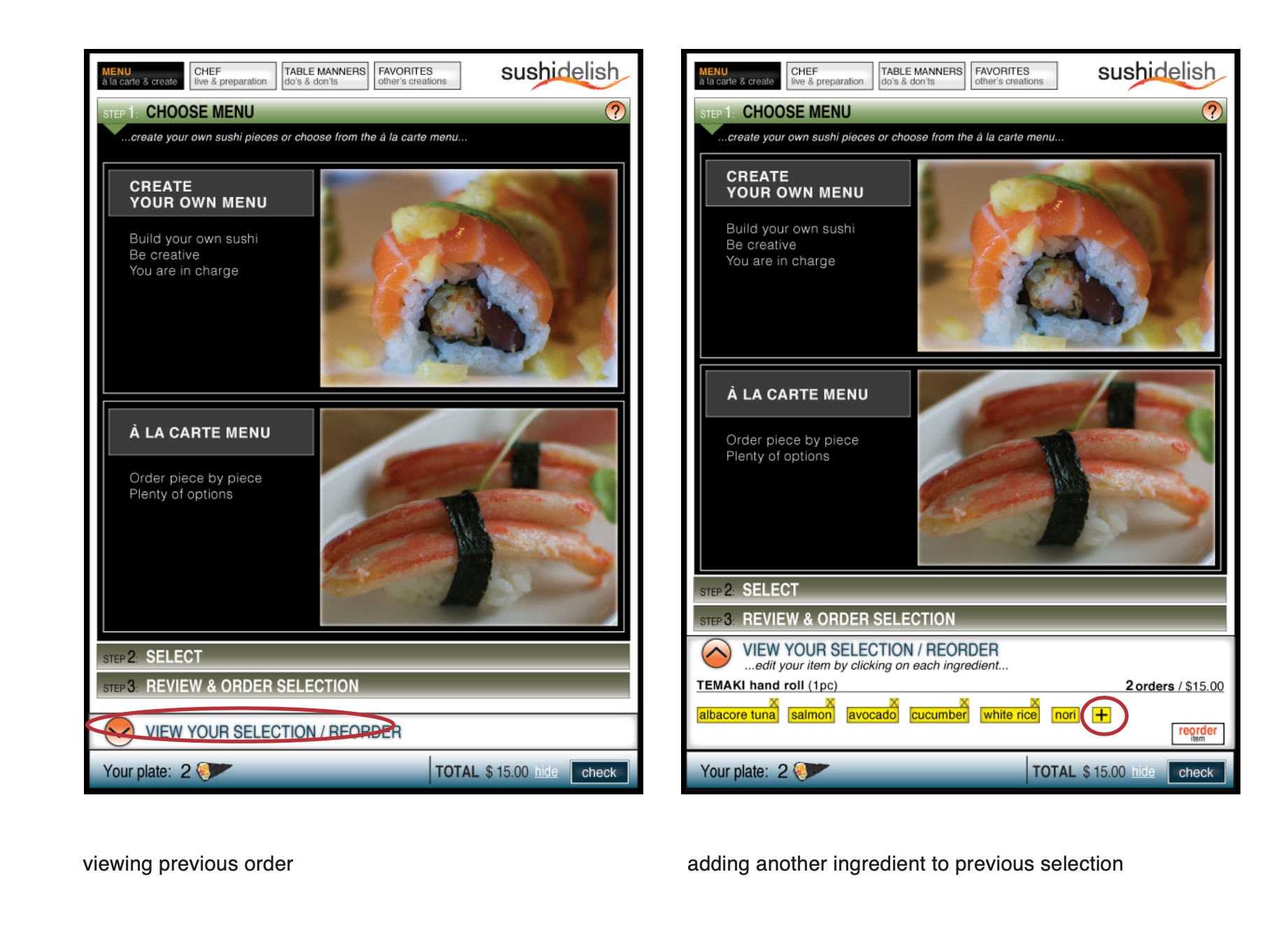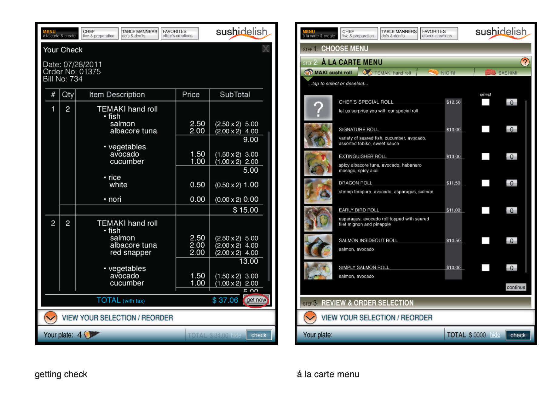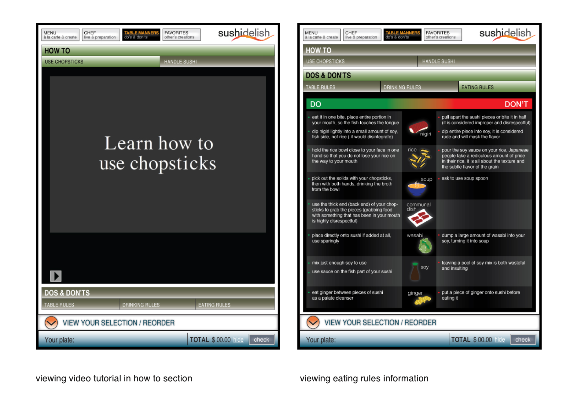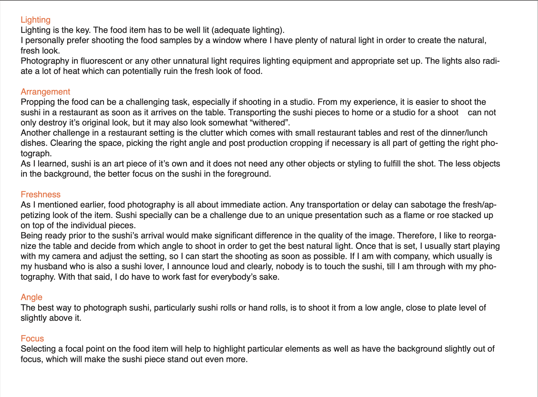
SushiDelish is a simulation for touch screen real world application, an interactive tool that allows customers to create their own sushi in an engaging way.
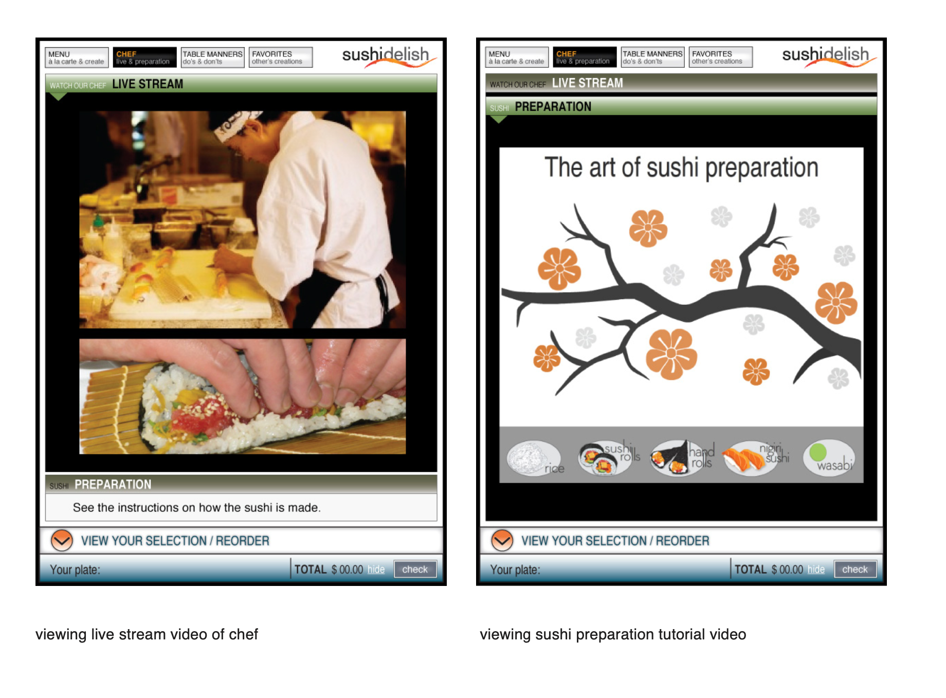
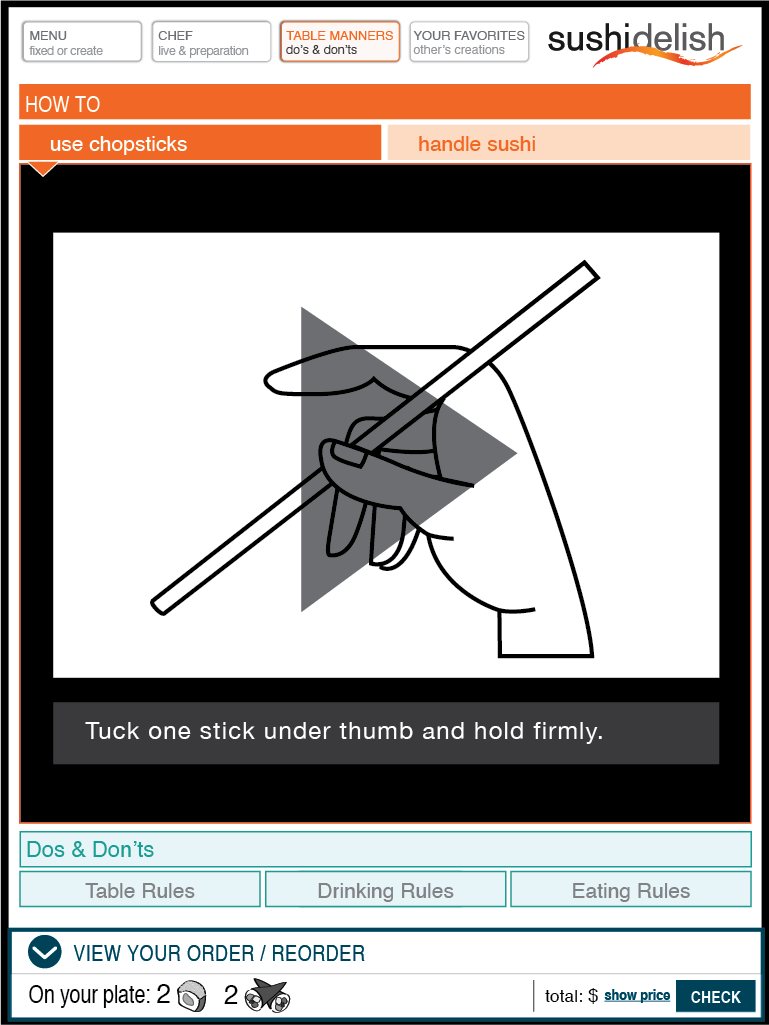
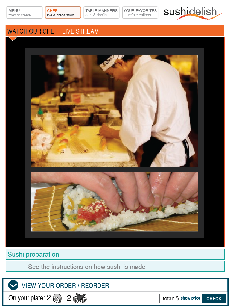
A Japanese restaurant equipped with this technology would offer a small touch screen device at each table upon arrival. This option, to order remotely, would also give customers the chance to be in complete control of their order, entertain themselves and learn various information about sushi as well as give them the opportunity to view live stream video of the chef preparing the meal.
Sushi Delish customers would not only be experienced returning customers, but also people who are new to sushi and such technology. Therefore, this application needs to communicate in a simple and direct way, but also in engaging and perhaps a challenging and/or educational manner for those who know sushi restaurants inside out to keep their attention and continuous interest.
{ TARGET AUDIENCE }
{Target Audience}
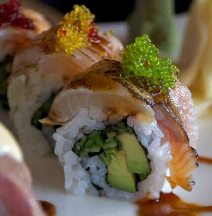
SushiDelish application has two groups of people as their target audience.
Primary Audience
• Sushi lovers
• Computer savvy adults, familiar with touch screen technology
• Age ranging from early twenties to late fifties, any gender or ethnicity
• Higher income and level of education, worldly individuals
• People living or working in the city
Secondary Audience
• New to sushi cuisine
• Somewhat computer savvy adults
• Parents with children
• Teenagers
• People coming in from the suburban areas
{ Big SSNif }
{Target Audience}
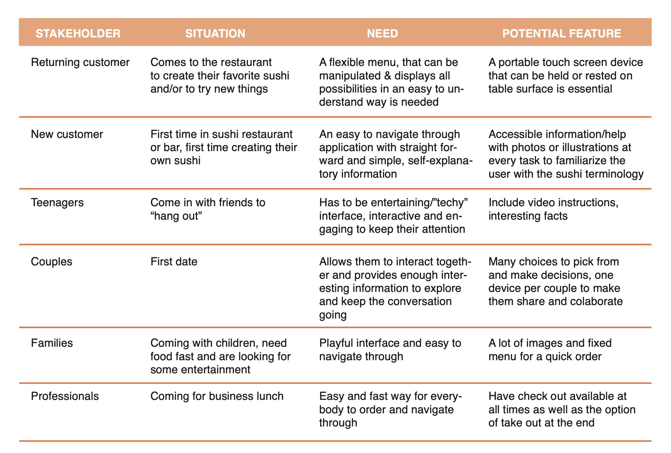
I conducted thorough research and competitive analysis of other restaurant sites that have a database with menus allowing customers to order online;
- an attribute that demonstrates a certain ordering form in a very structured list like arrangement
- a simple and easy to navigate through – similarity to a regular restaurant menu
- using icons during the ordering process, (smart way of how to incorporate photos and illustrations), it also helps to make this process appealing, easy on the eye, efficient, less “wordy” and well organized approach.
- well organized structure and flow of this process, self-explanatory for the user, despite of the amount of information provided
- very user friendly customization of items
{ Little SSNif }
{Target Audience}

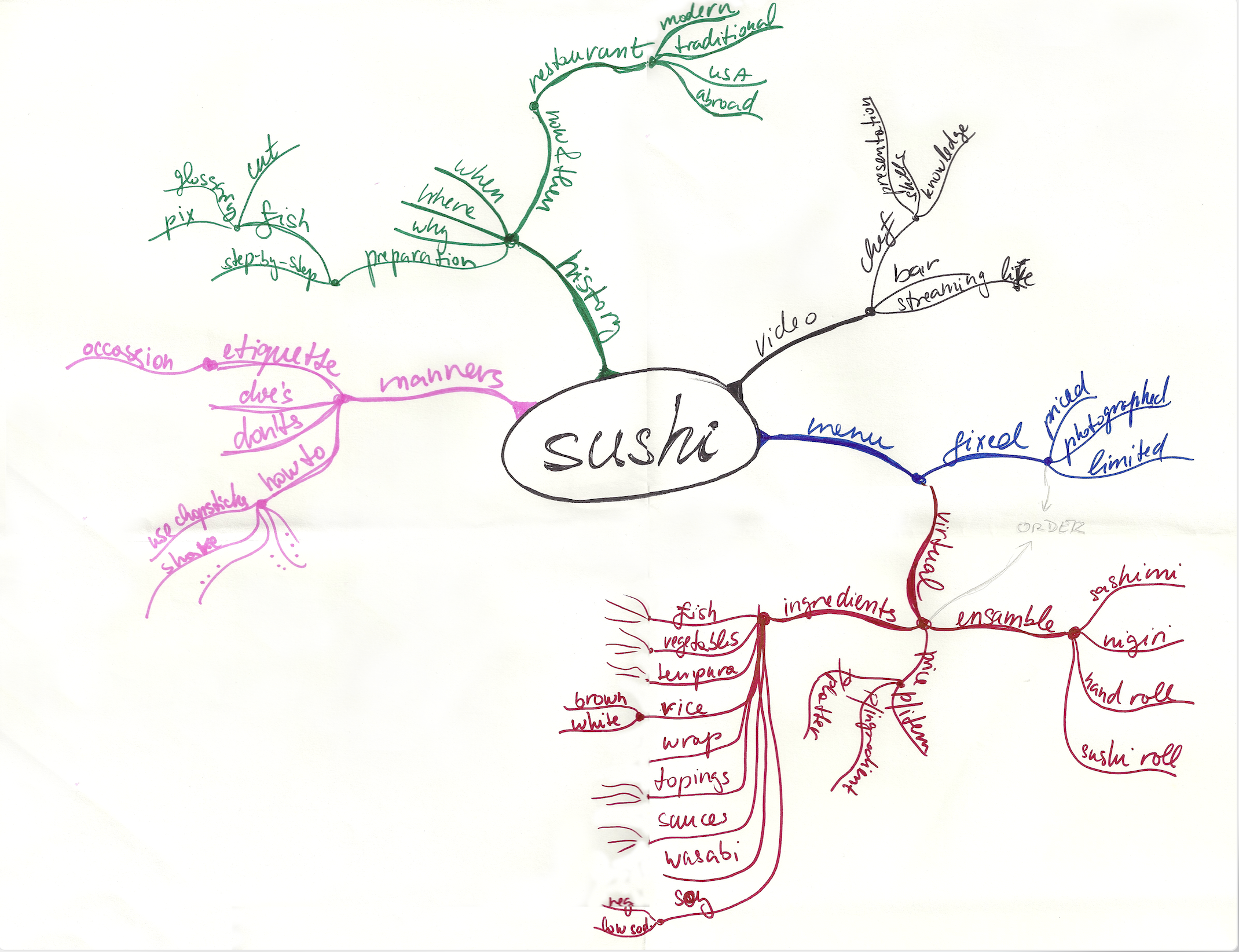
{ MIND MAP }
{Target Audience}
Brainstorming for this application was crucial. It helped to visually
organize information, and establish hierarchy
{ MOOD BOARDS }
{Target Audience}
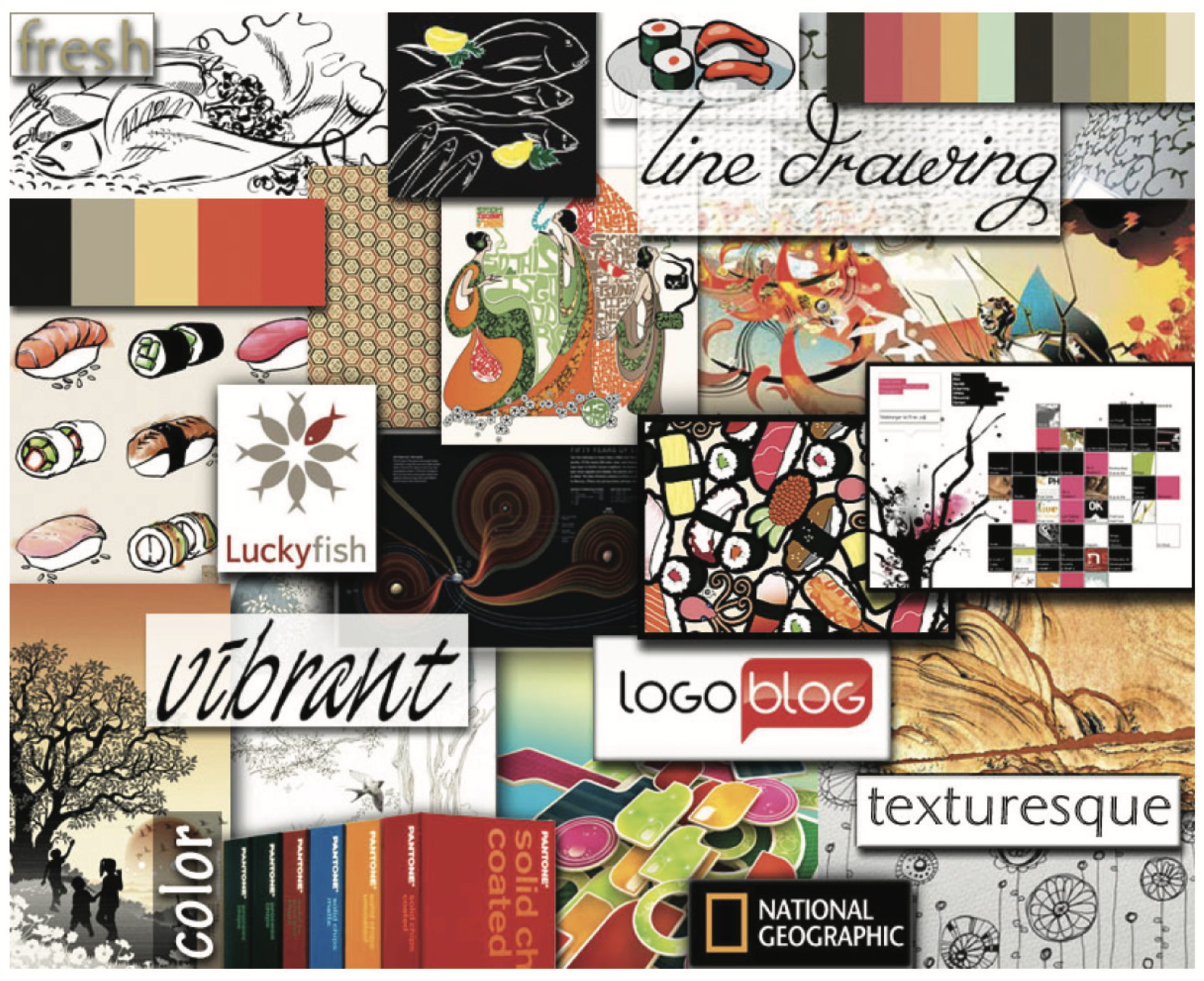
Illustrative
• line drawing
• vibrant
• texturesque
• warm
• colorful
{ MOOD BOARDS }
{Target Audience}
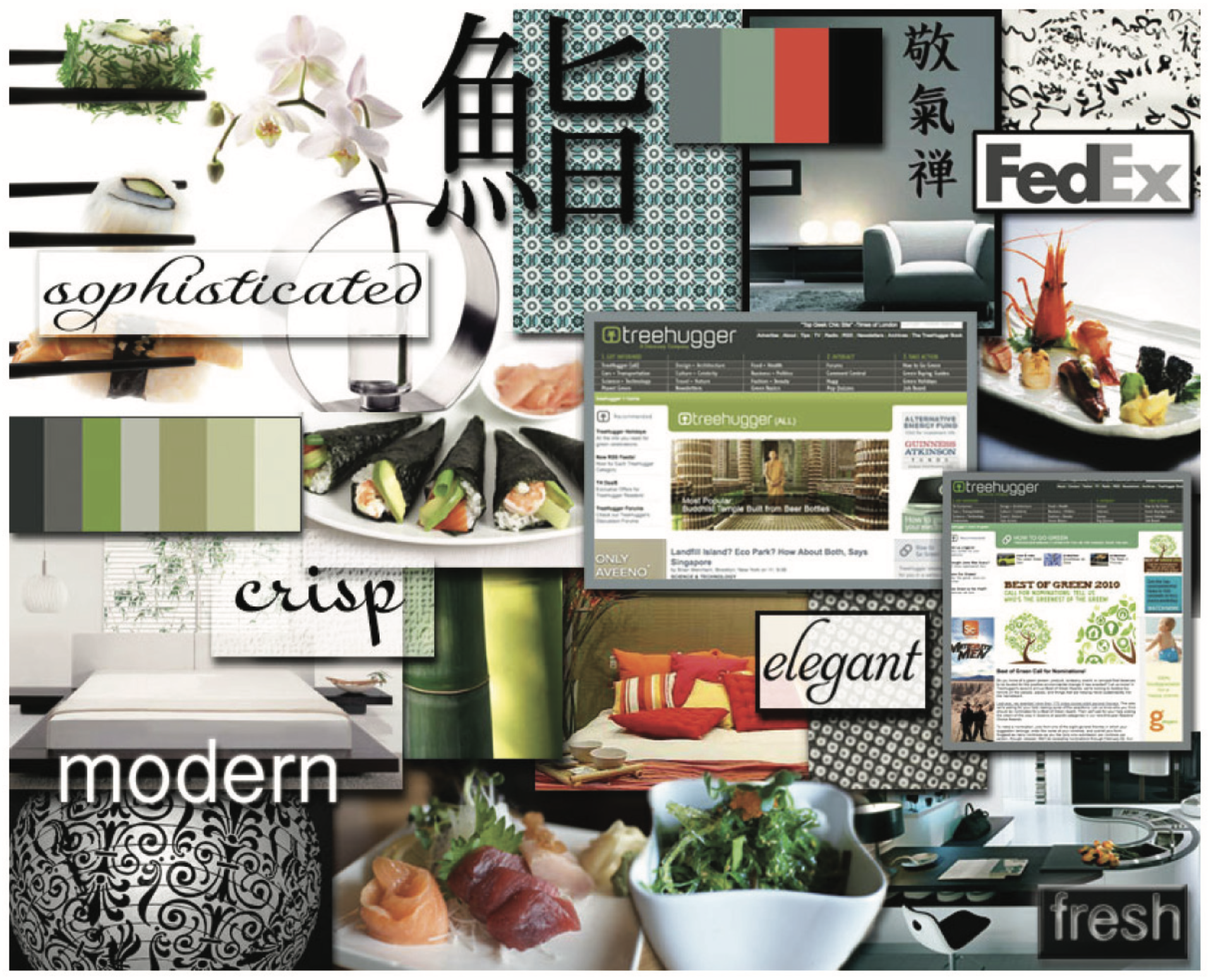
Photographic
• sophisticated
• elegant
• crisp
• fresh
• modern
{ MOOD BOARDS }
{Target Audience}
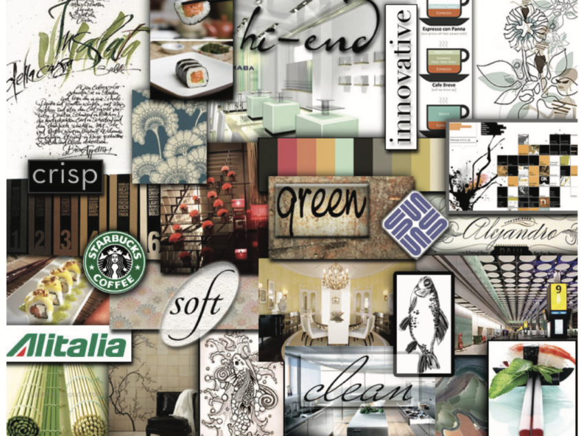
Combination
• soft
• hi-end
• clean
• whimsical
• organic
• green
CONCEPT DESIGN :
Information Architecture
Personas
Use Cases
Wireframes
{ Information architecture }
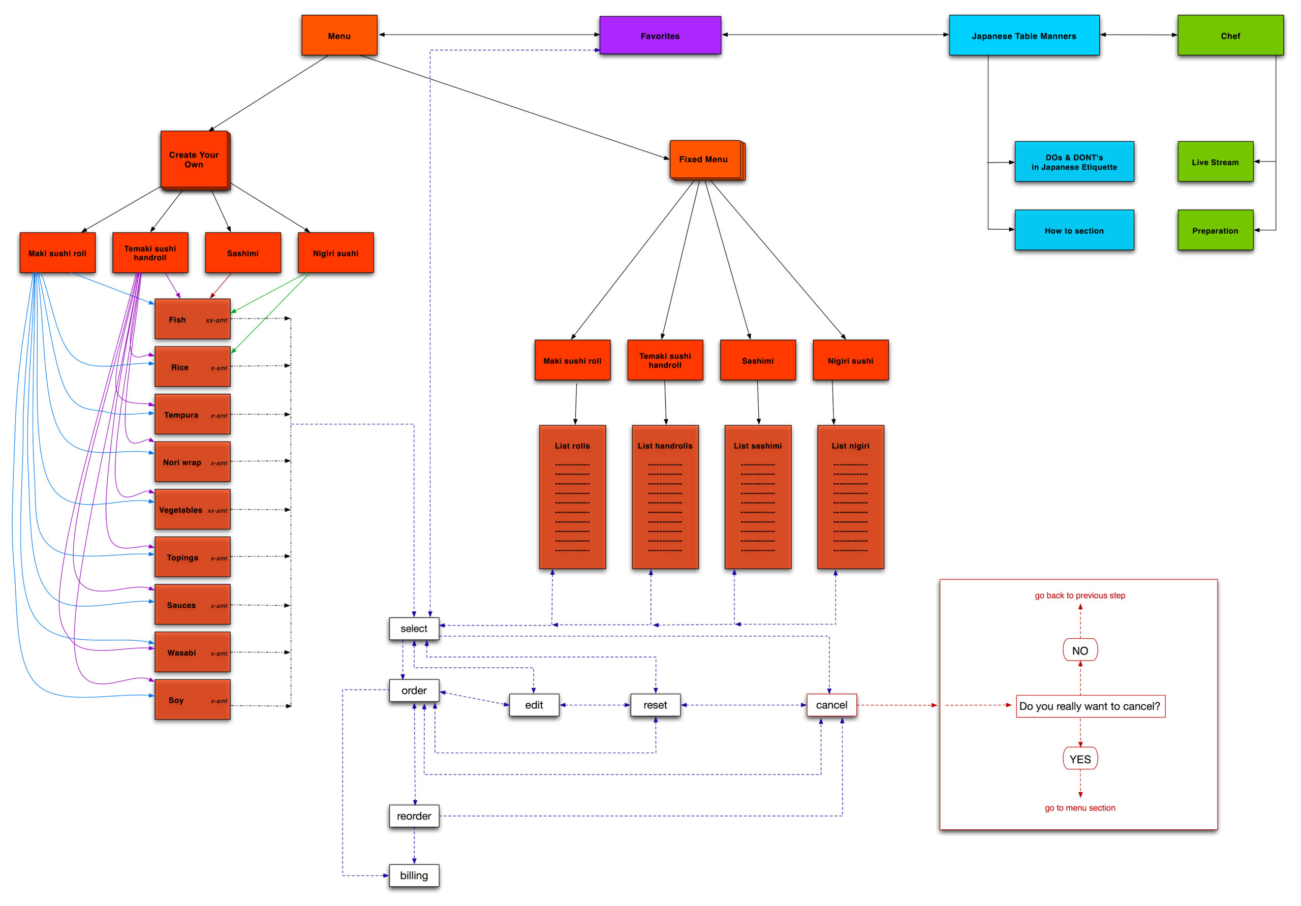
{ personas }
Mary

{ personas }
Eduardo
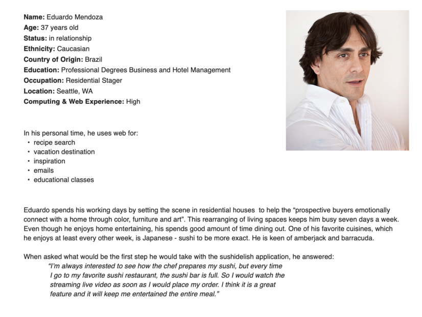
{ personas }
Smith Family
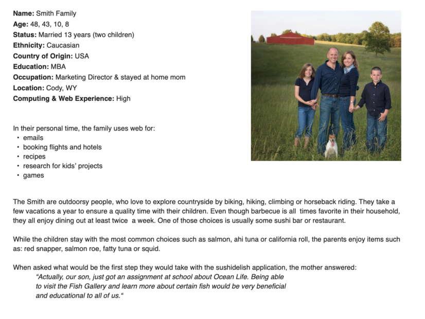
{ personas }
Erin & Eric
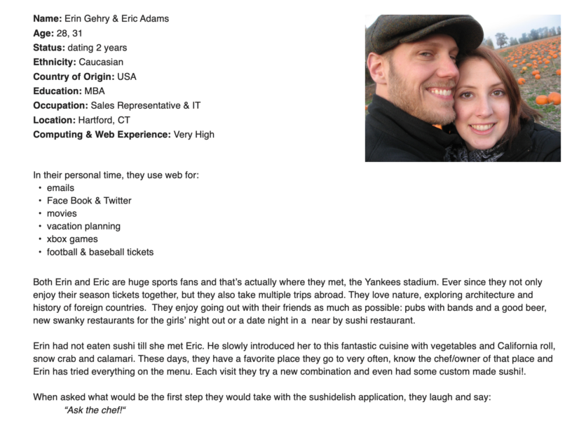
{ personas }
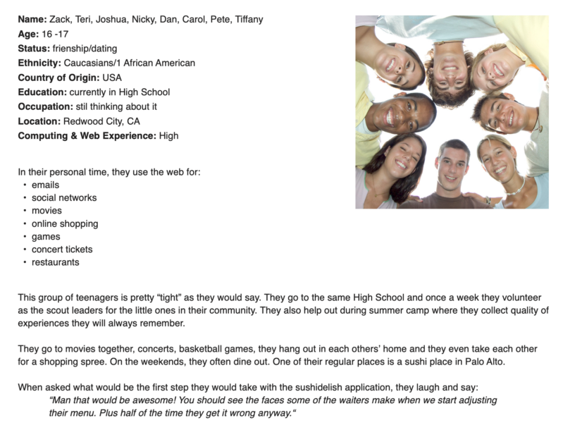
Teenagers
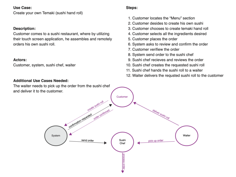
{ use cases }
# 1
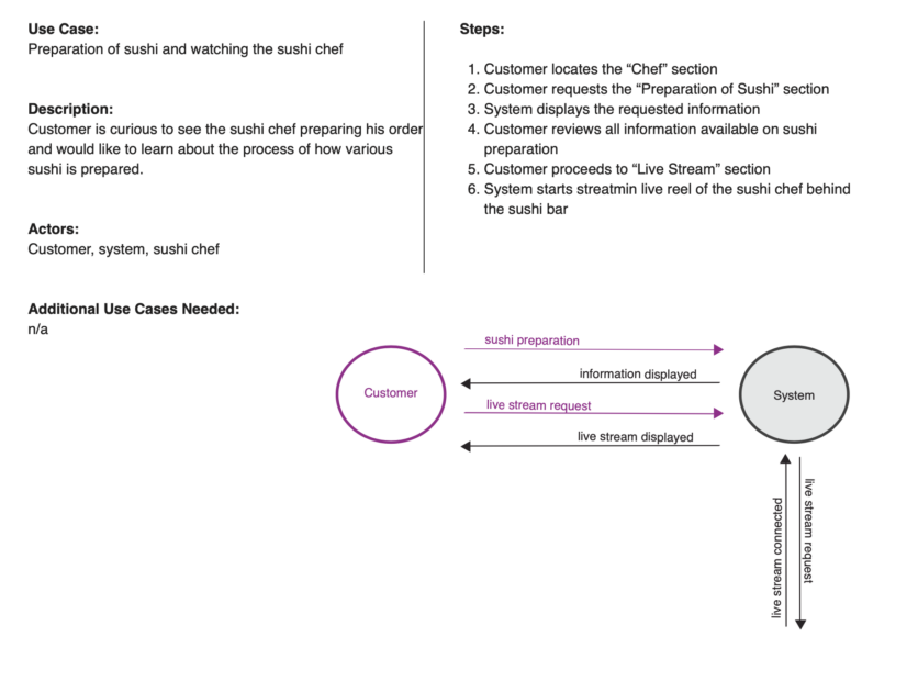
{ use cases }
# 2
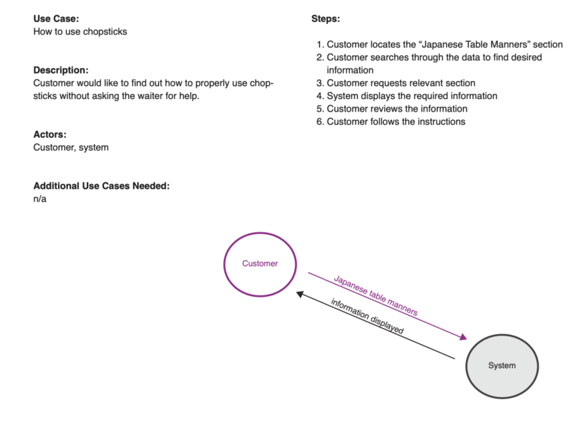
{ use cases }
# 3
{ wireframes }
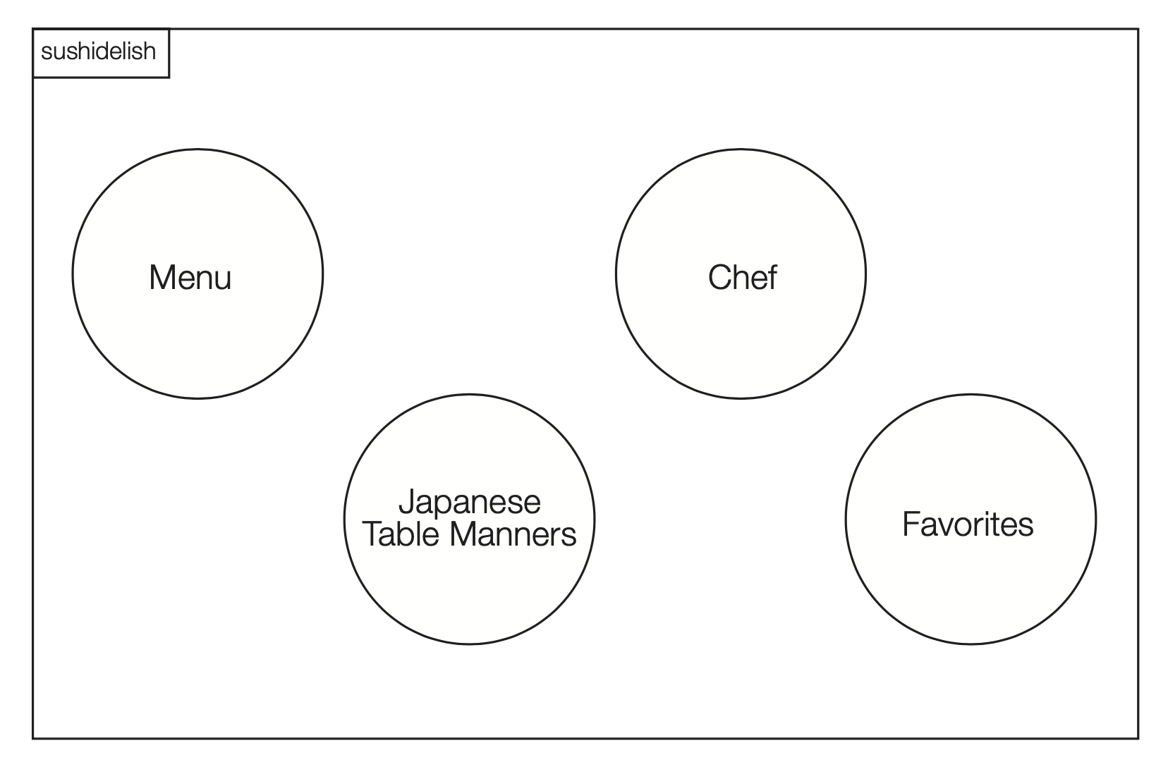
Simple Wireframes
Home Page
{ wireframes }
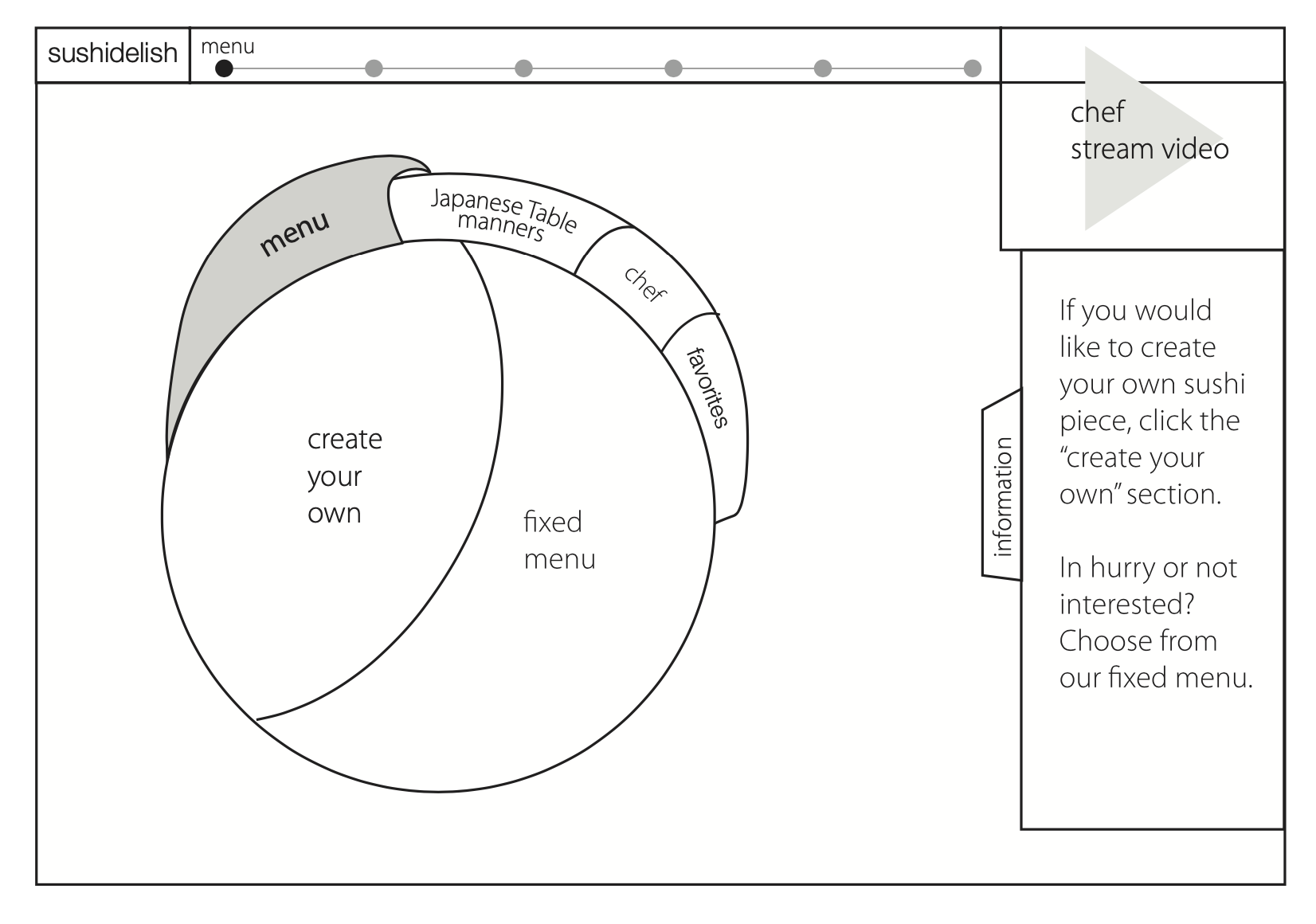
Simple Wireframes
Level 1 – Choosing Menu
{ wireframes }
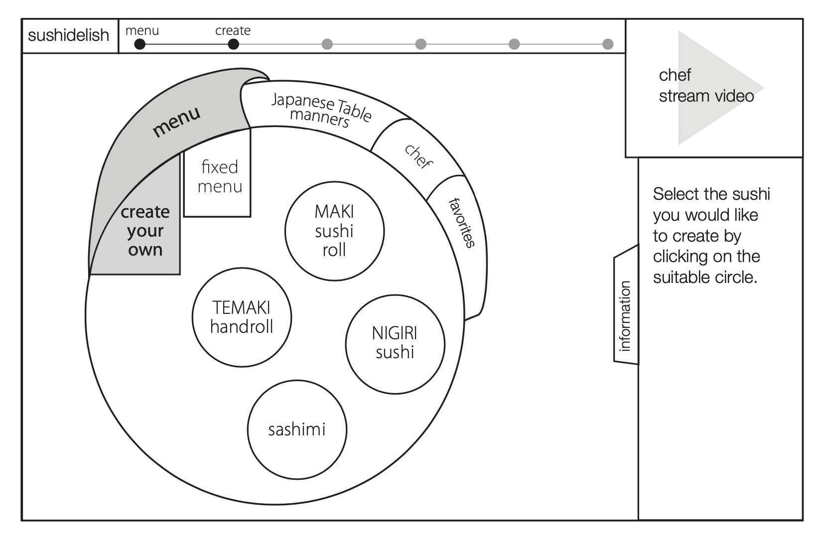
Simple Wireframes
Level 2 – Create Your Own Sushi
{ wireframes }
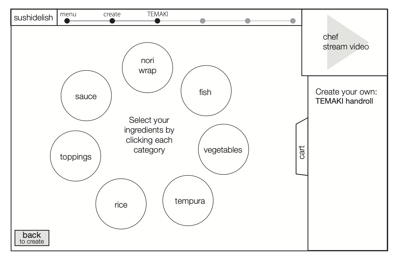
Simple Wireframes
Level 3 – Selecting Ingredient Category
{ wireframes }
Simple Wireframes
Level 4 – Pick Ingredients
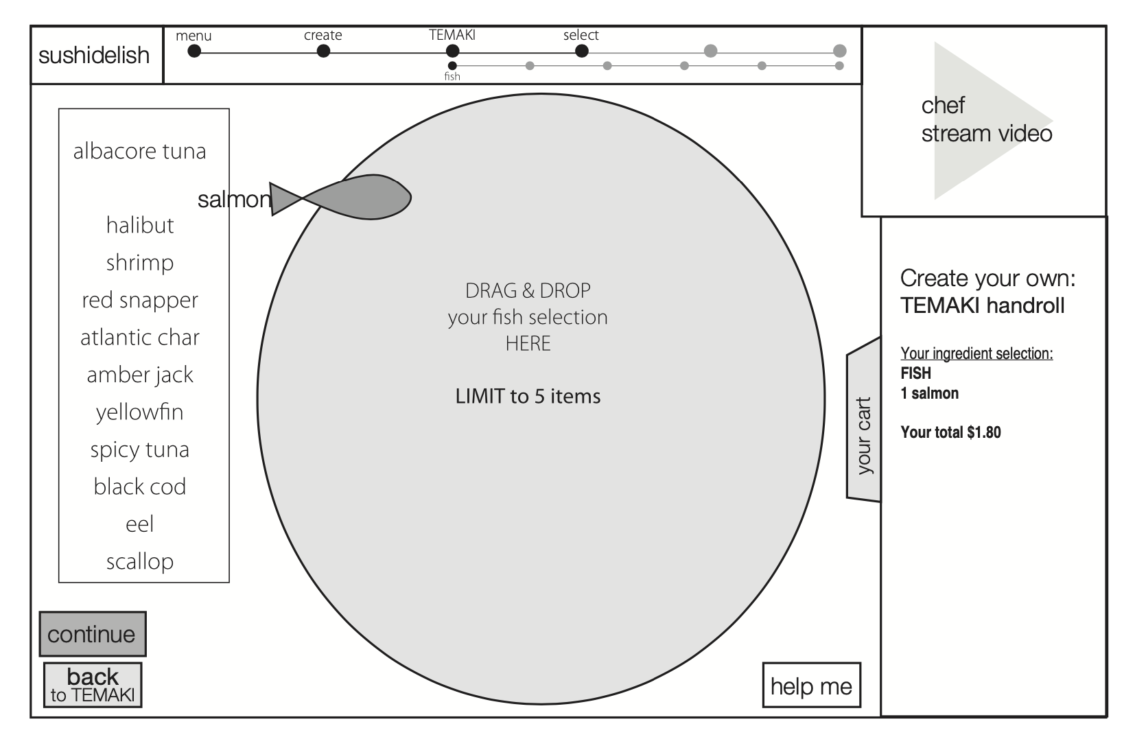
{ wireframes }
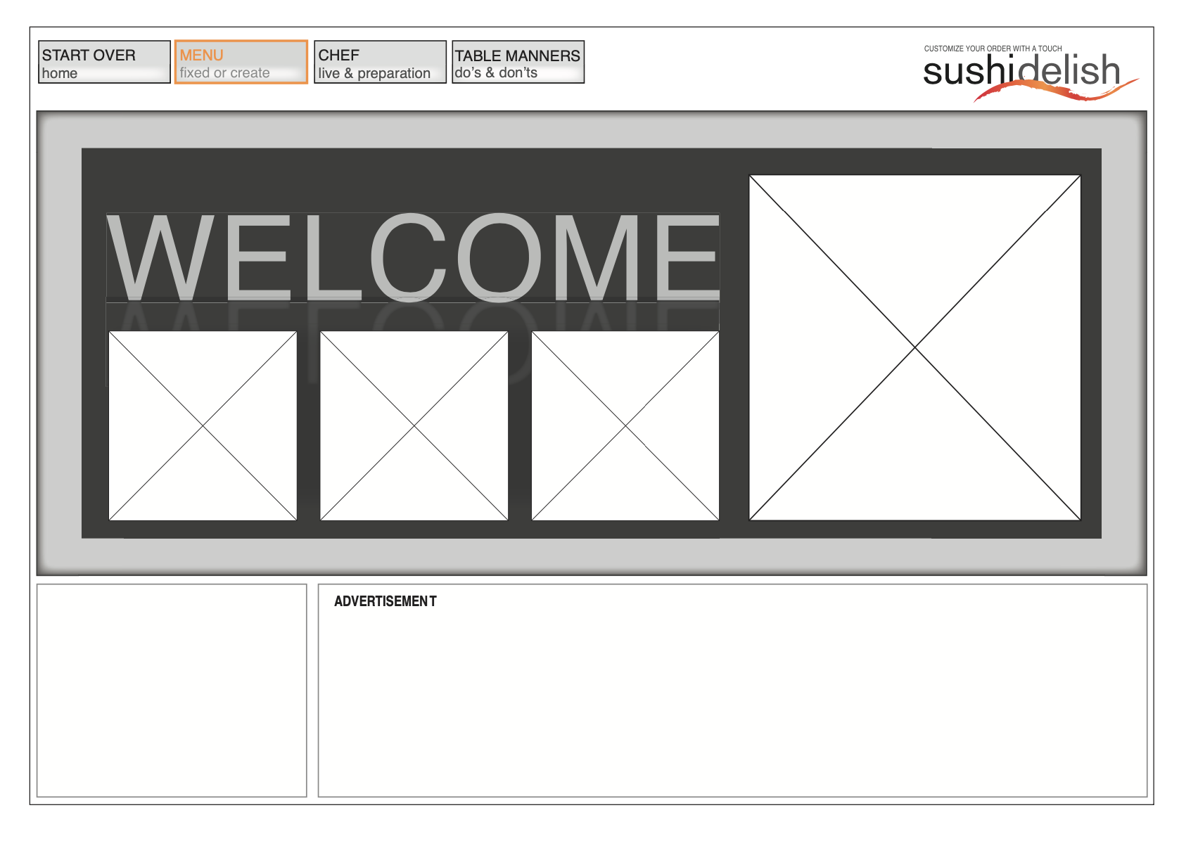
Interactive Wireframes
Home Page
{ wireframes }
Interactive Wireframes
Level 1 – Choosing Menu
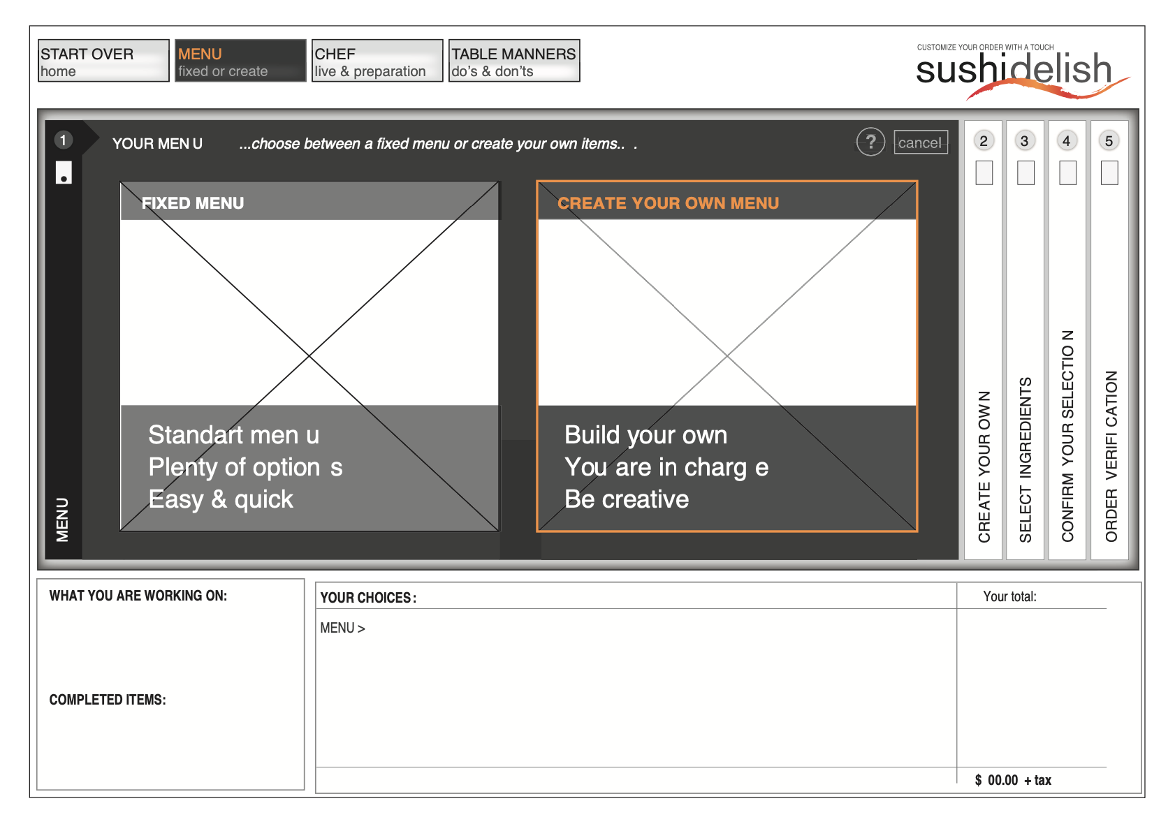
{ wireframes }
Interactive Wireframes
Level 2 – Create Your Own Sushi
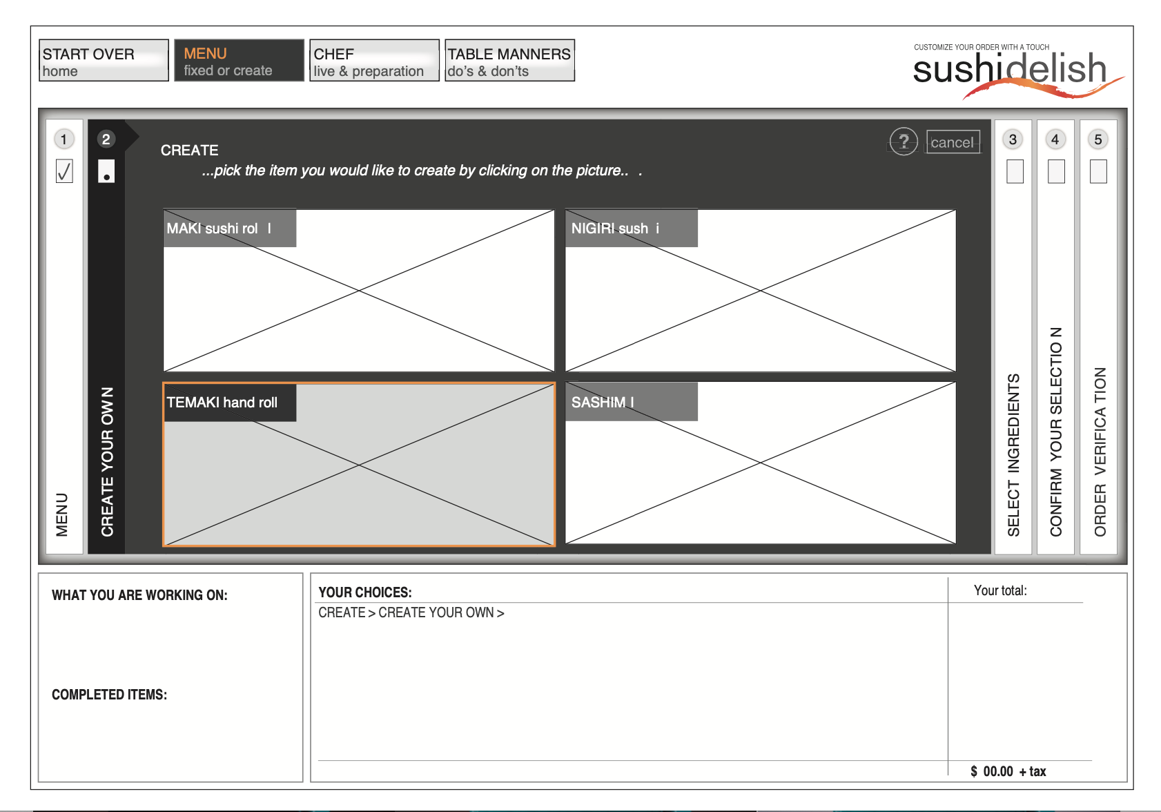
{ wireframes }
Interactive Wireframes
Level 3 – Selecting Category & Ingredients
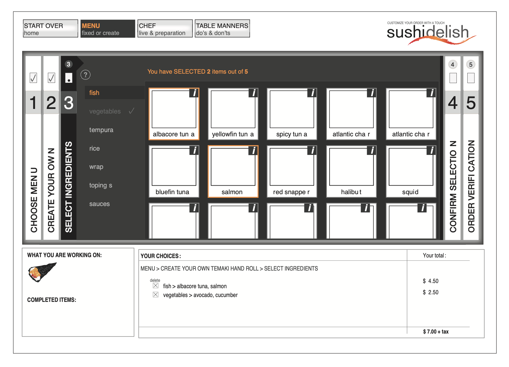
{ wireframes }
Interactive Wireframes
Level 4 – Confirmation
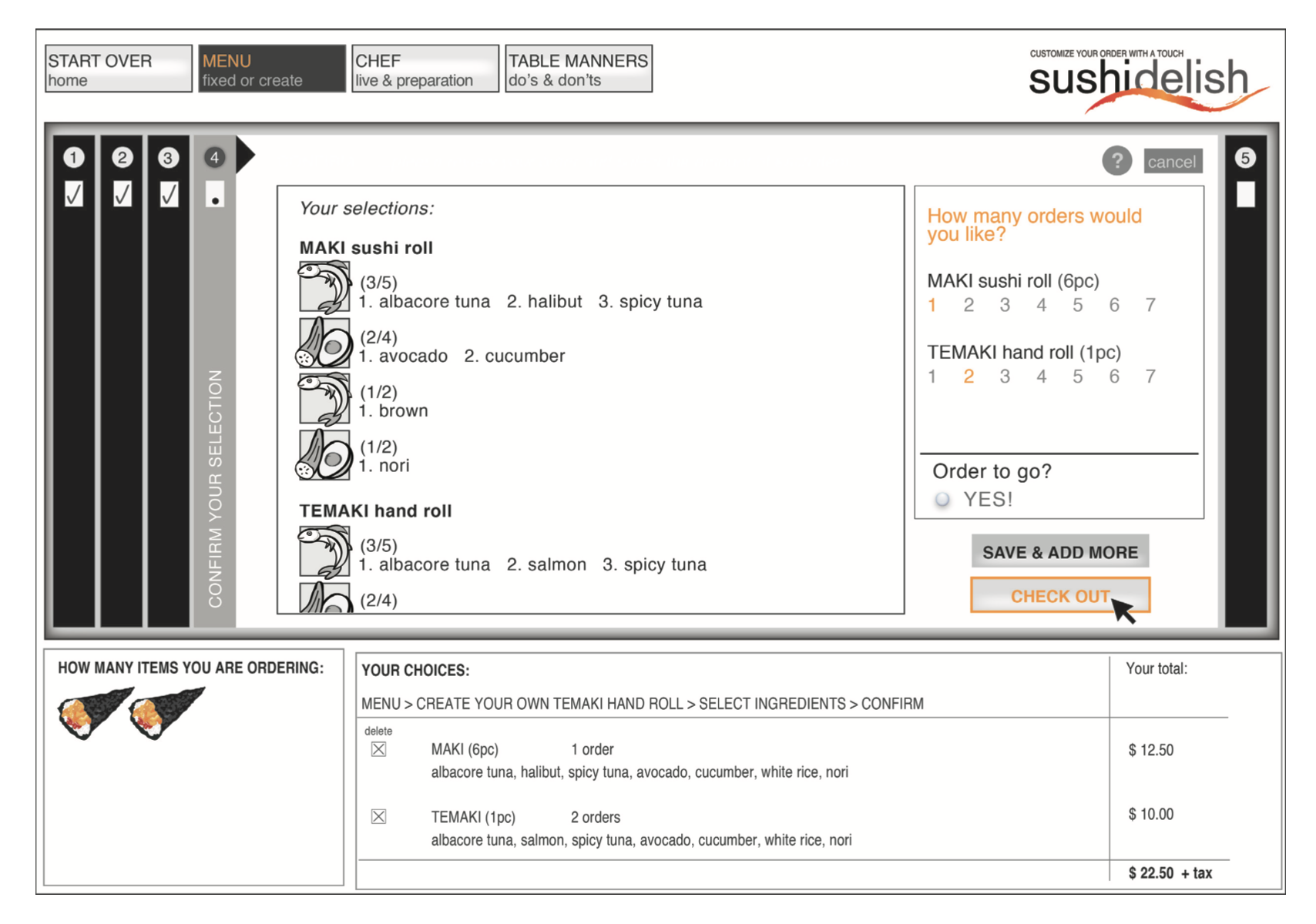
{ wireframes }
Final Stage of Wireframe Development
After further testing I came to a conclusion, horizontal lay- out can be very limiting and it may require a lot of scrolling at certain pages.
I decided to convert the application design to a portrait format and lock the rotate feature at iPad to make it more convenient for the user.
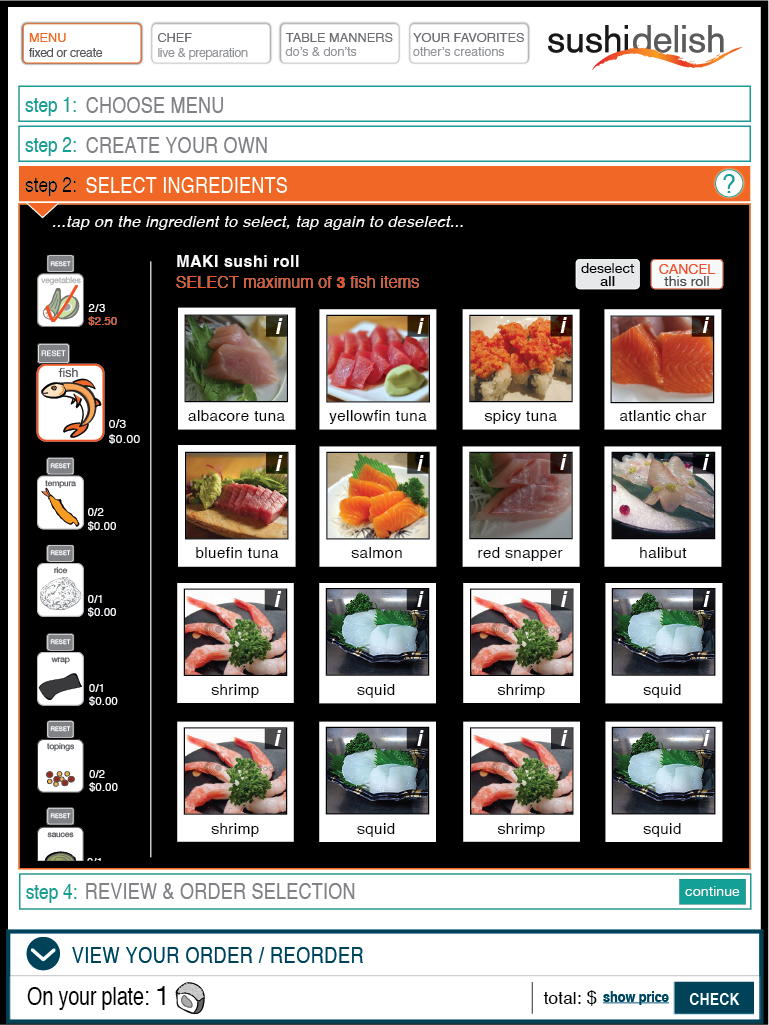
Another major realization was the fact, that user responds faster and easier to ingredient icons rather than a list of ingredients spelled out.
Based on all of these observations, I developed my final wireframes and perfected the functionality.
Final Wireframes: Home Page
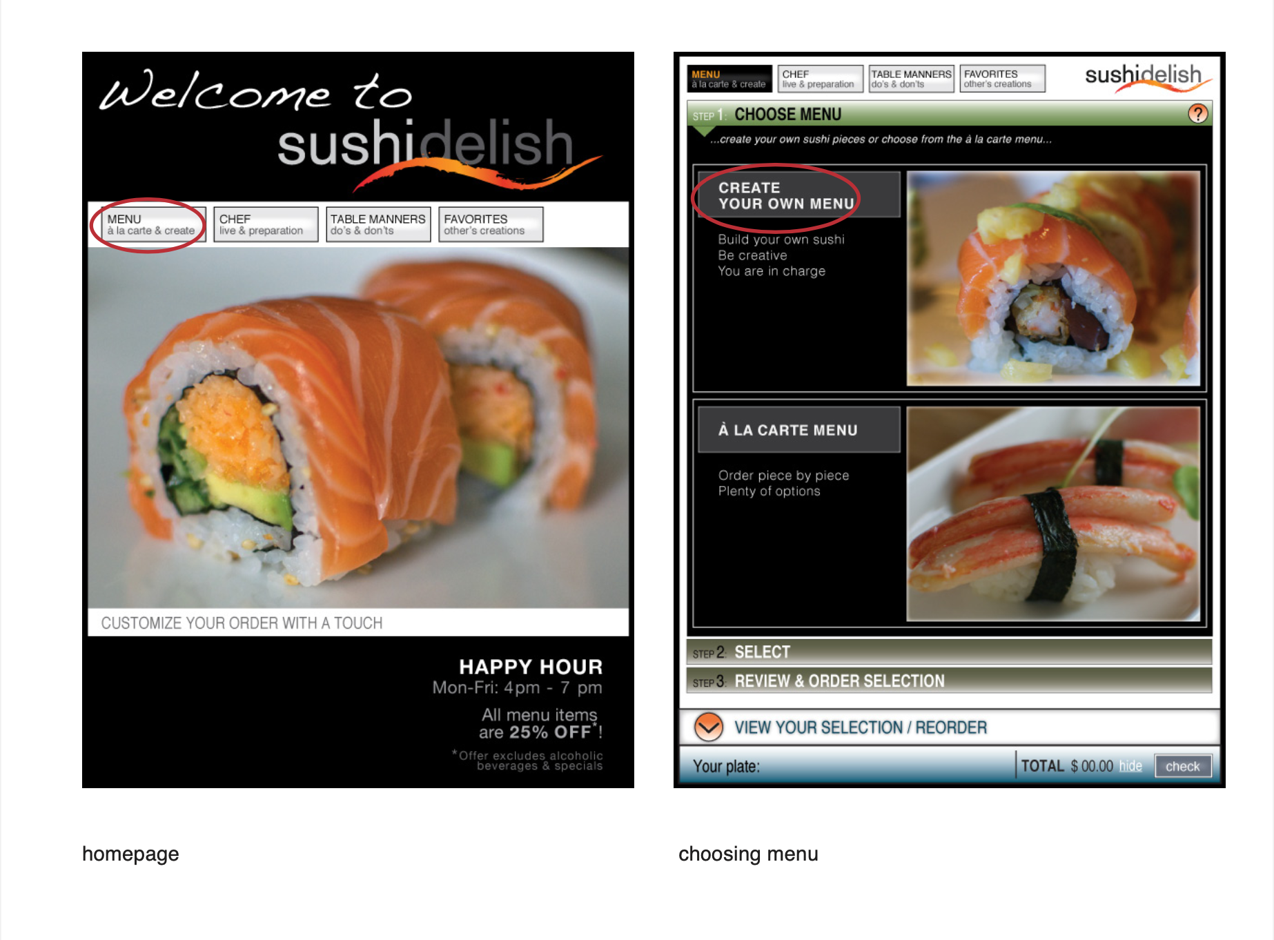
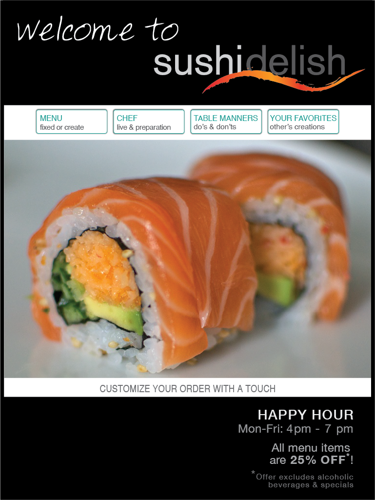
The home page is designed in minimalist and modern way, with main navigation that consists of four categories.
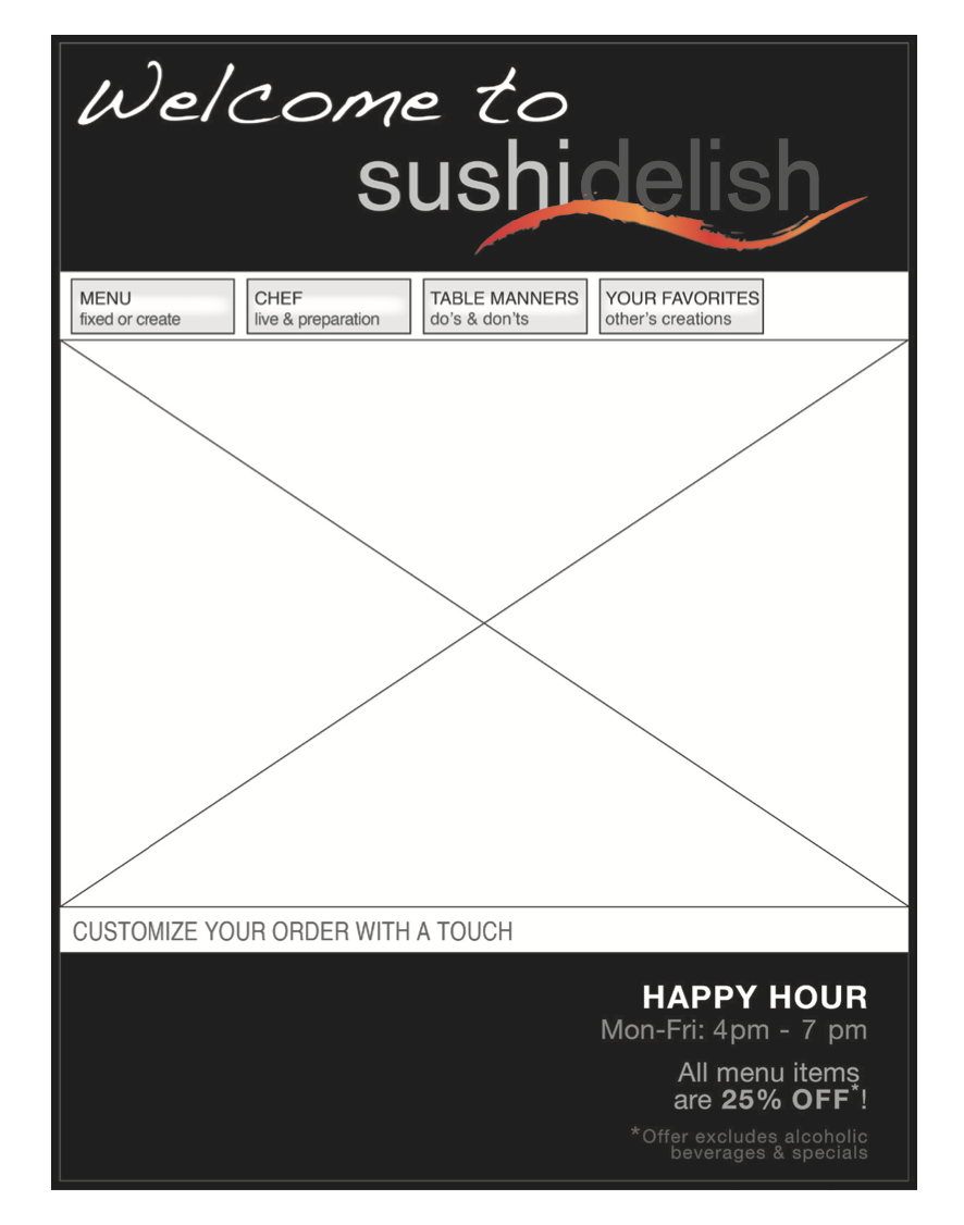
{ wireframes }
Final Stage of Wireframe Development
Final Wireframes:
Level 1 – Choosing Menu
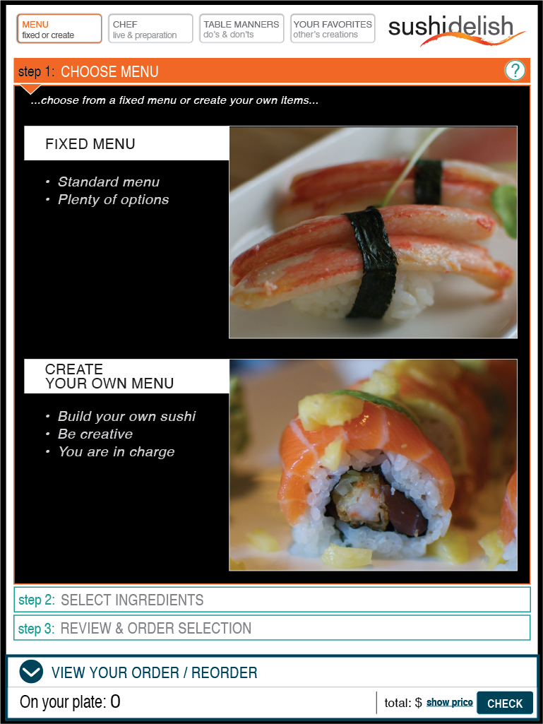
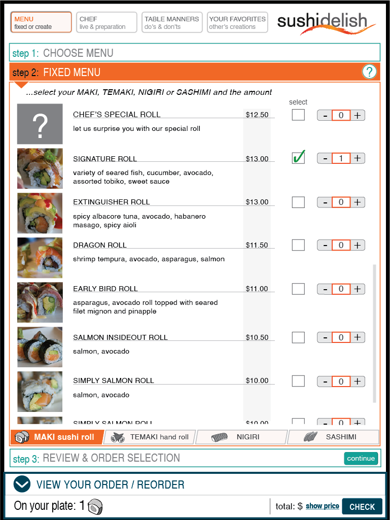
Once user clicks MENU button he will get choice to either pick from a la cart menu or he can assemble his own sushi pieces.
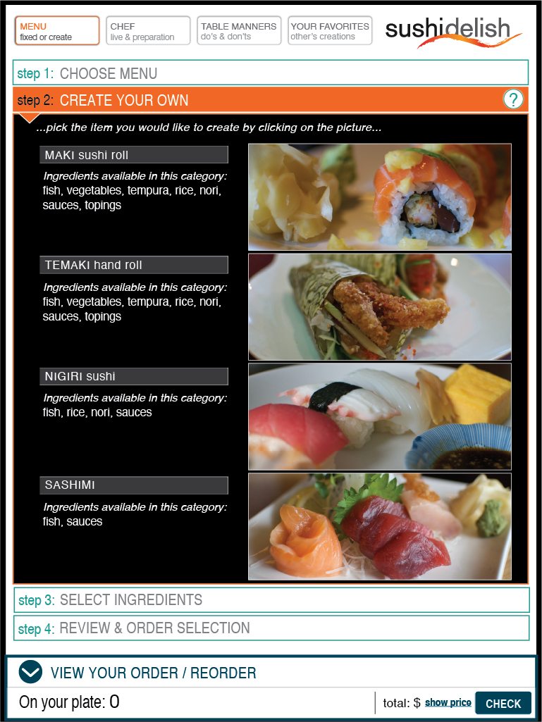
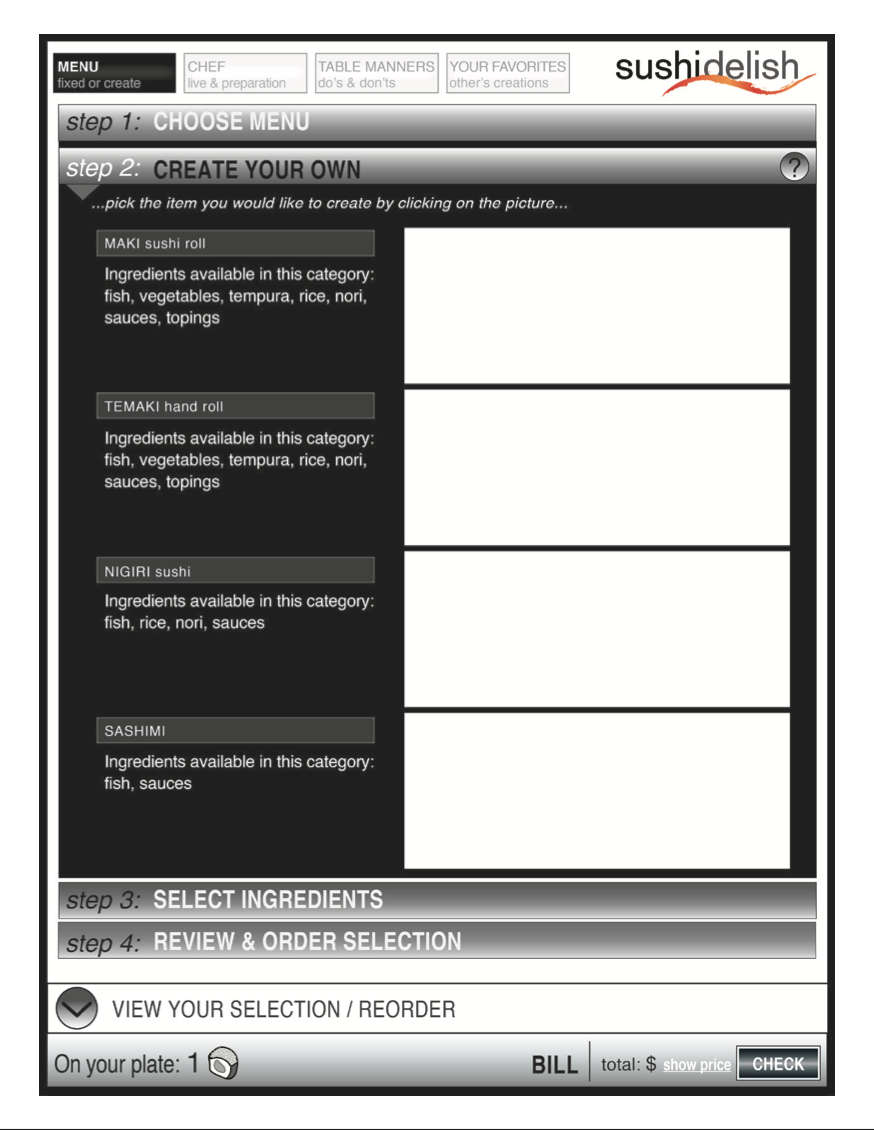
Level 2 – Create Your Own Sushi
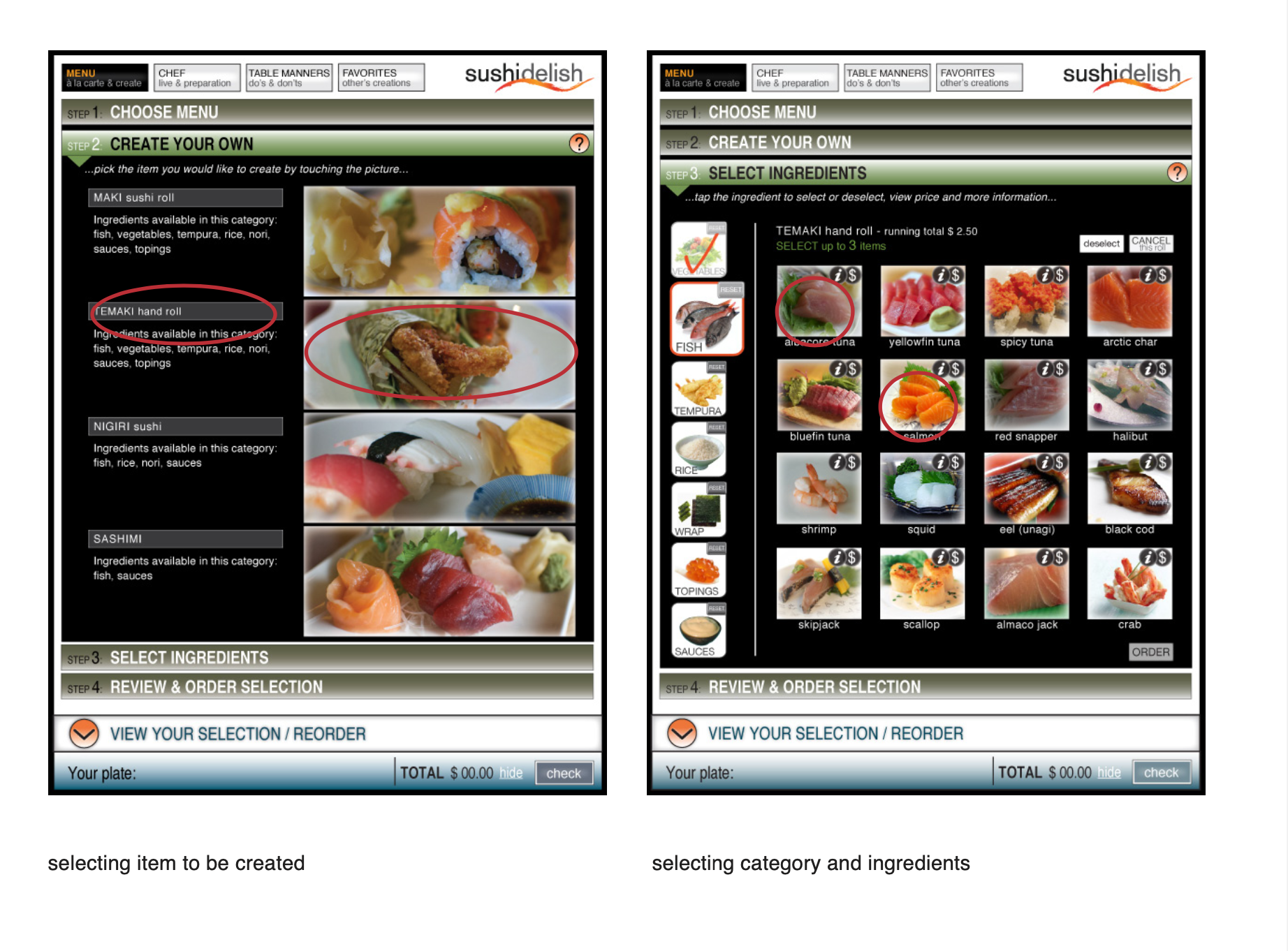
On this page user has the choice to select which items he would like to assemble.
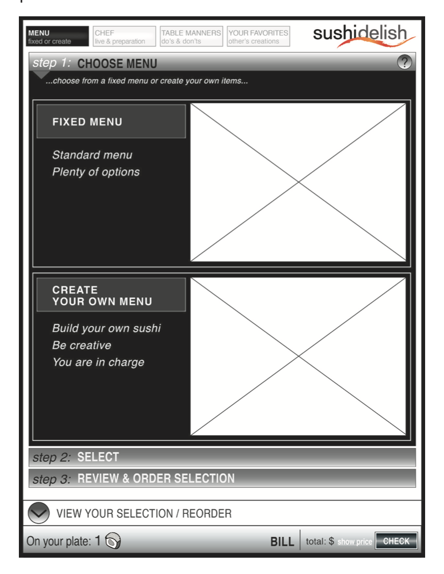
{ wireframes }
Final Stage of Wireframe Development
Final Wireframes:
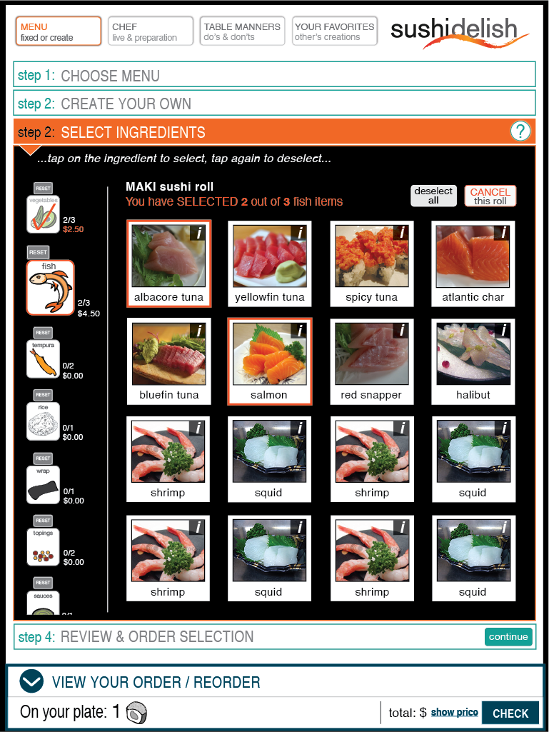
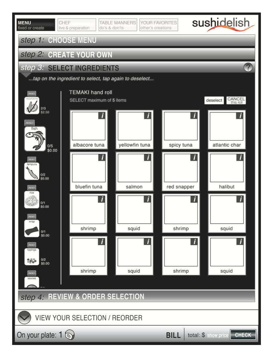
Level 3 – Selecting Category and its Ingredients
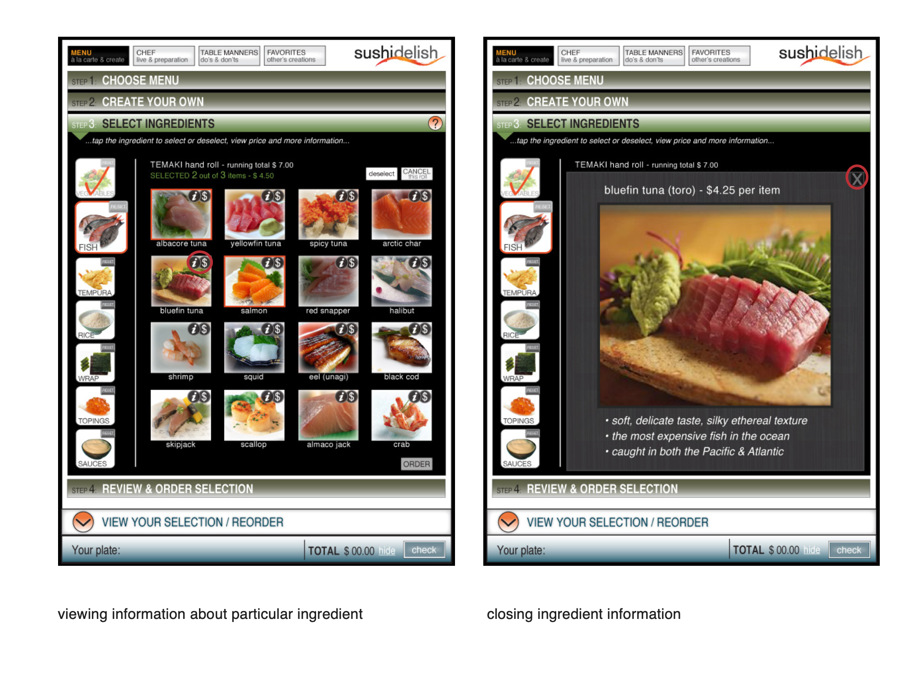
Each sushi category consists of specific ingredients. Once entered particular category, such as fish, user will see ingredients that he can explore and choose from.
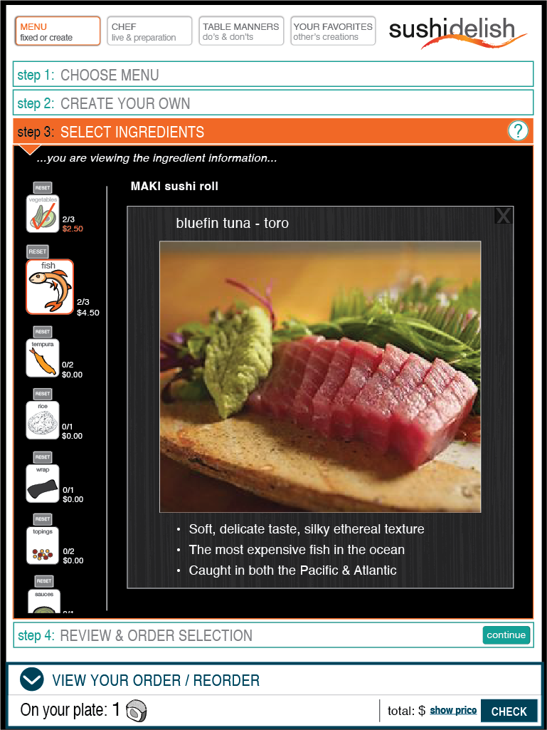
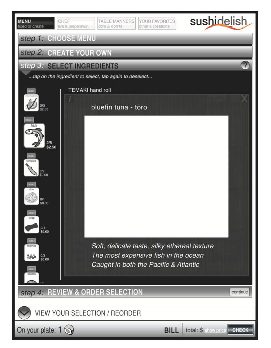
Level 3b – Viewing Each Ingredients
User can view detailed information about each ingredient by clicking on the information “i” icon in the upper right corner of the image.
{ wireframes }
Final Stage of Wireframe Development
Final Wireframes:
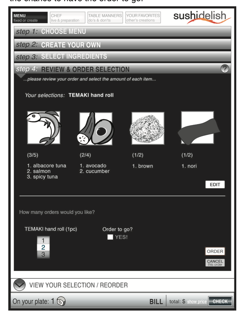
Level 4 – Order Confirmation
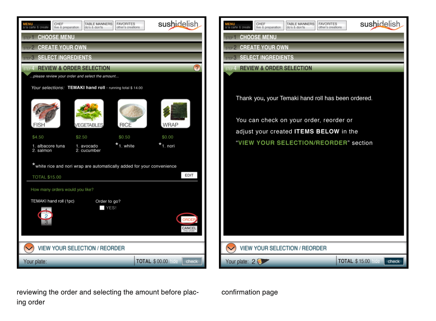
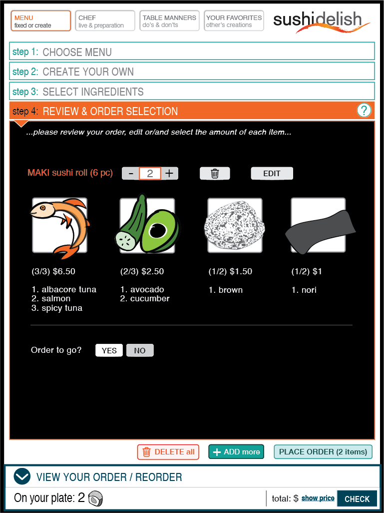
Once user selects his ingredients and proceeds to next step, he will get a screen with his order to review and select the amount of the created item. He would also get the chance to have the order to go.
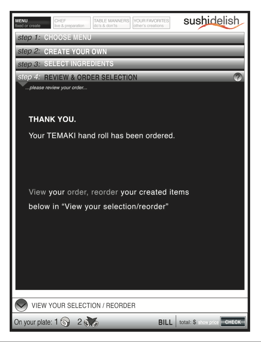
Level 5 – Order Acknowledgment
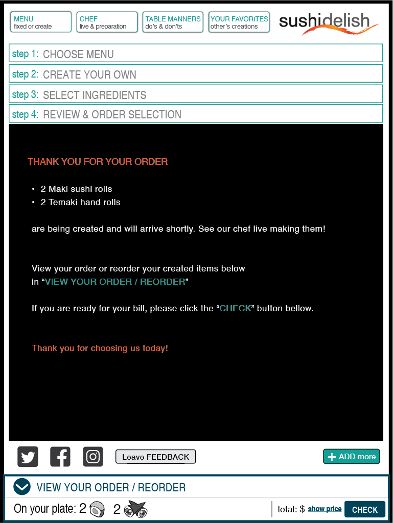
Confirmation about successful order would appear for about five seconds before the level 1 page comes up again to encourage the user to keep “shopping”.
VISUAL DESIGN :
Logo
Color Palette
Typography
Mockups
Interaction
Final Design
{ LOGO }
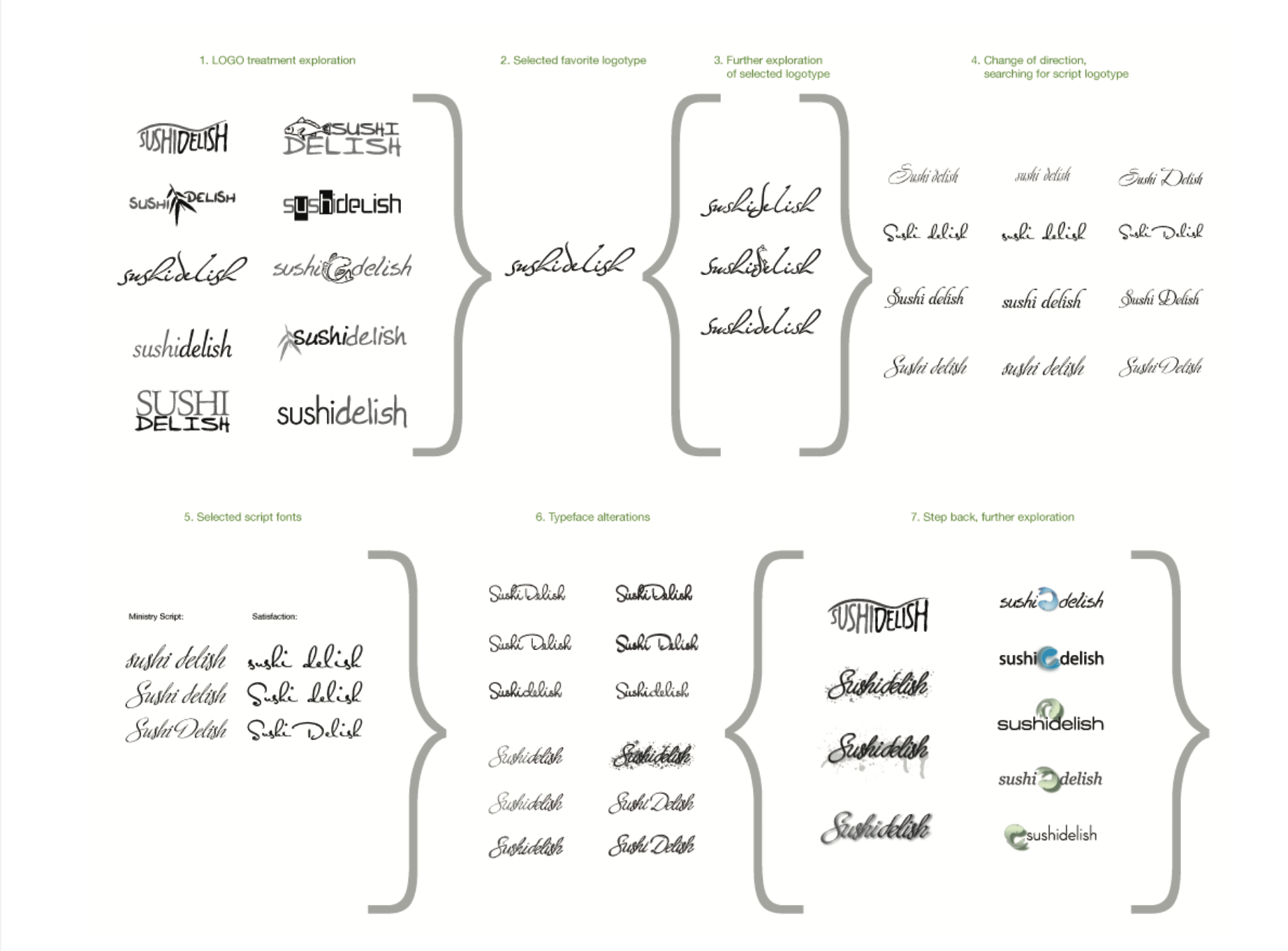
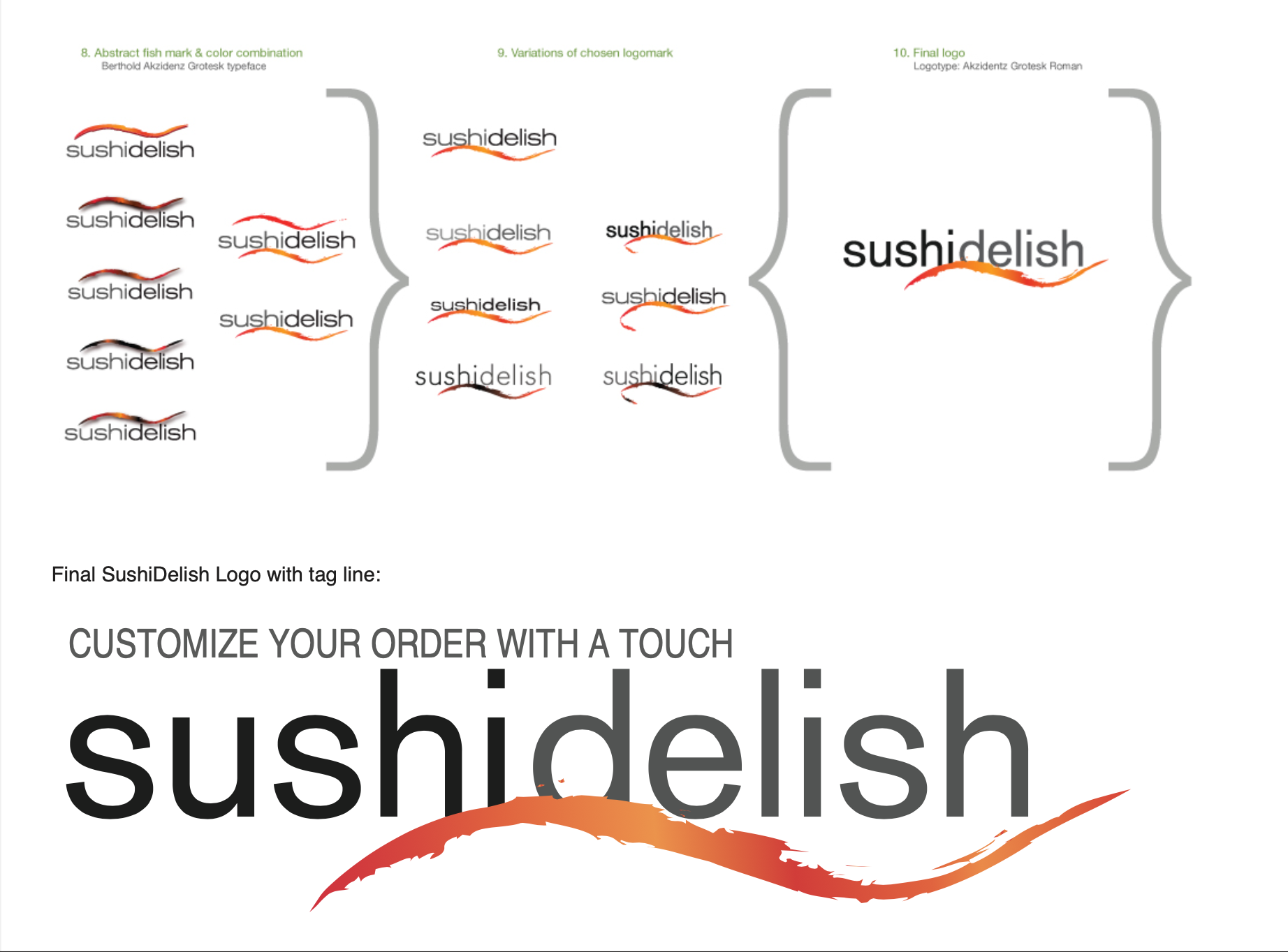
Logo Development
{ LOGO }
Logo Development
{ LOGO }
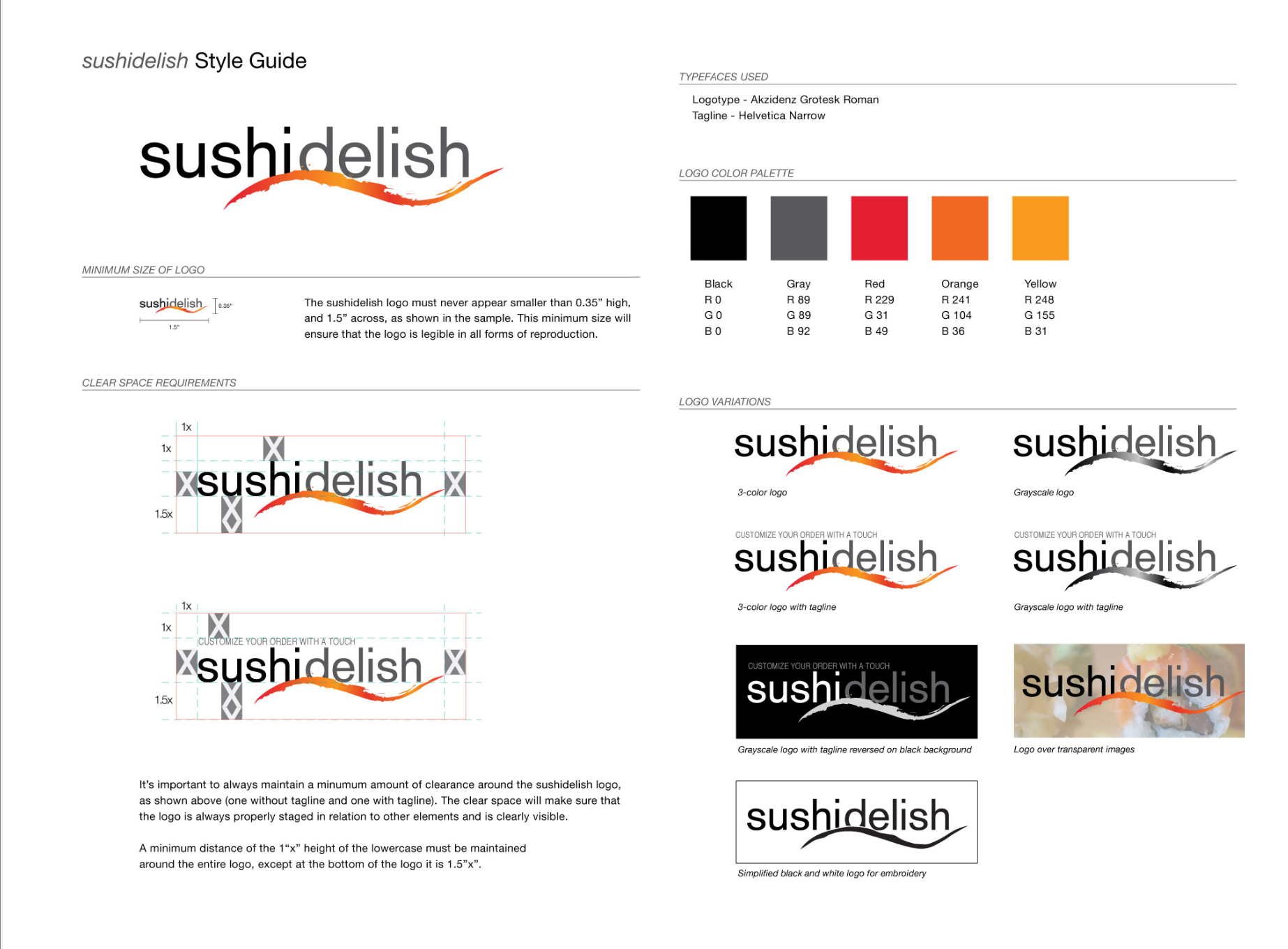
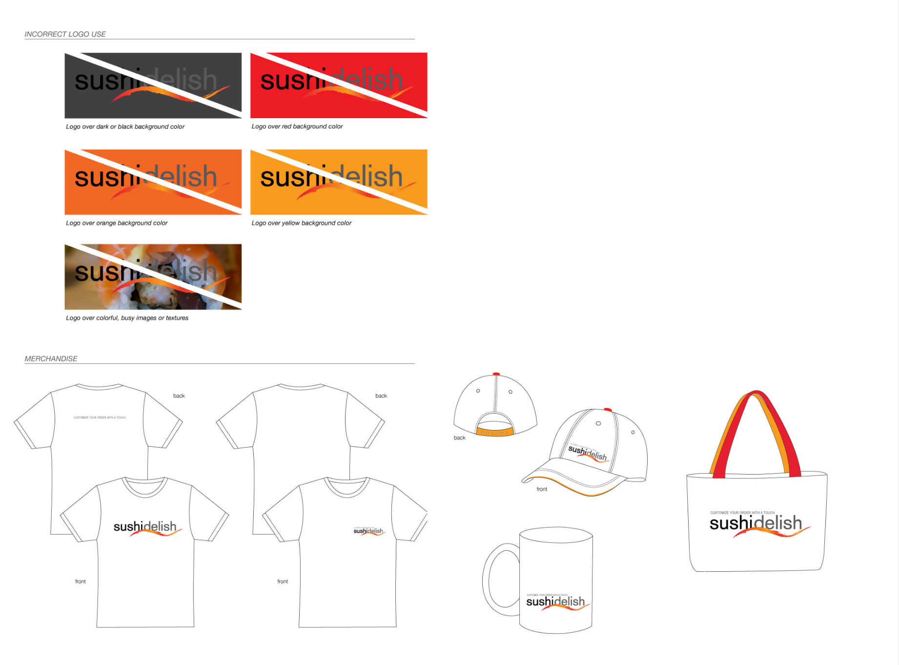
Logo Style Guide
{ LOGO }
Logo Style Guide
{ Aplication }
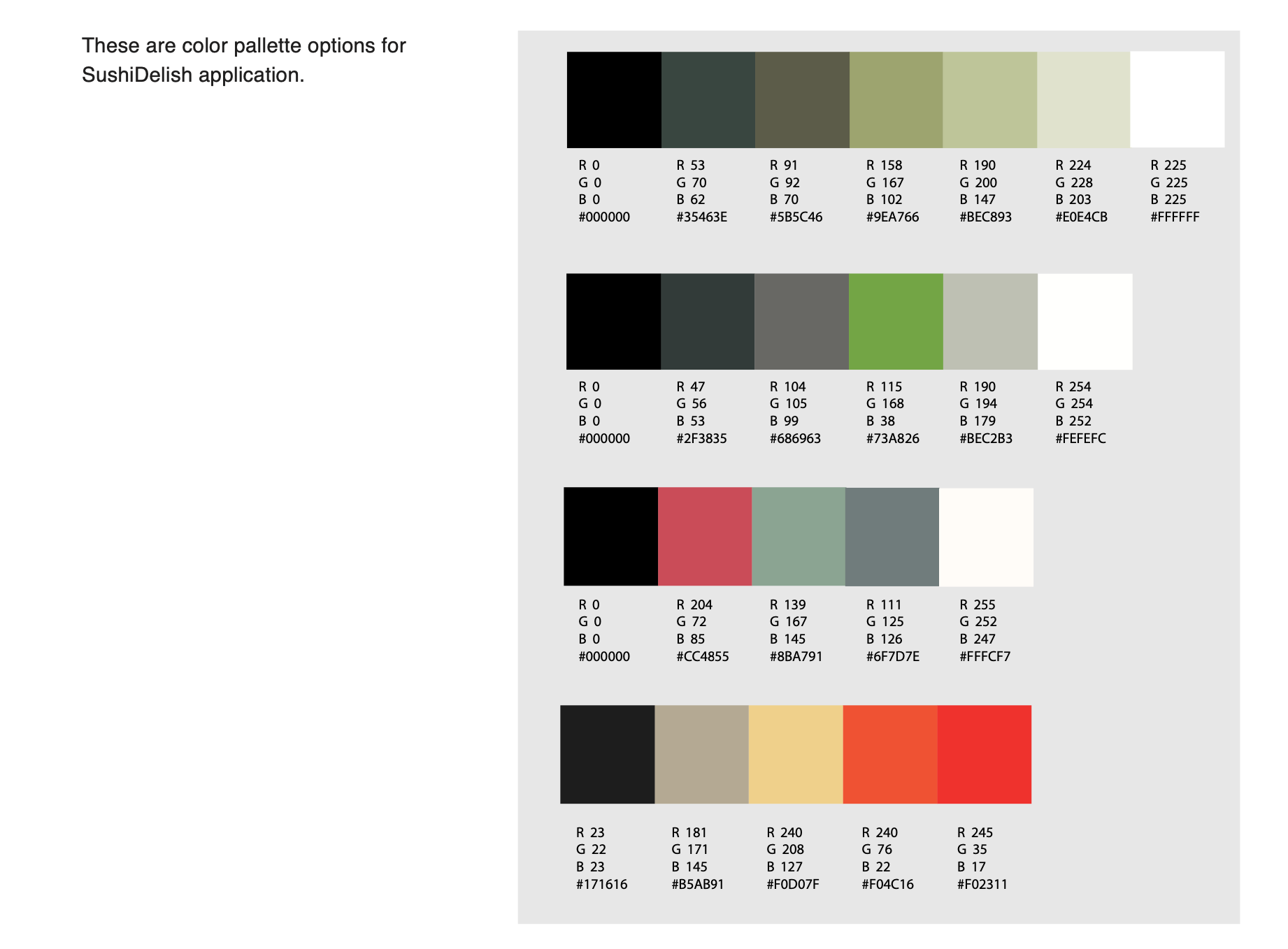
Color Palette
{ Aplication }
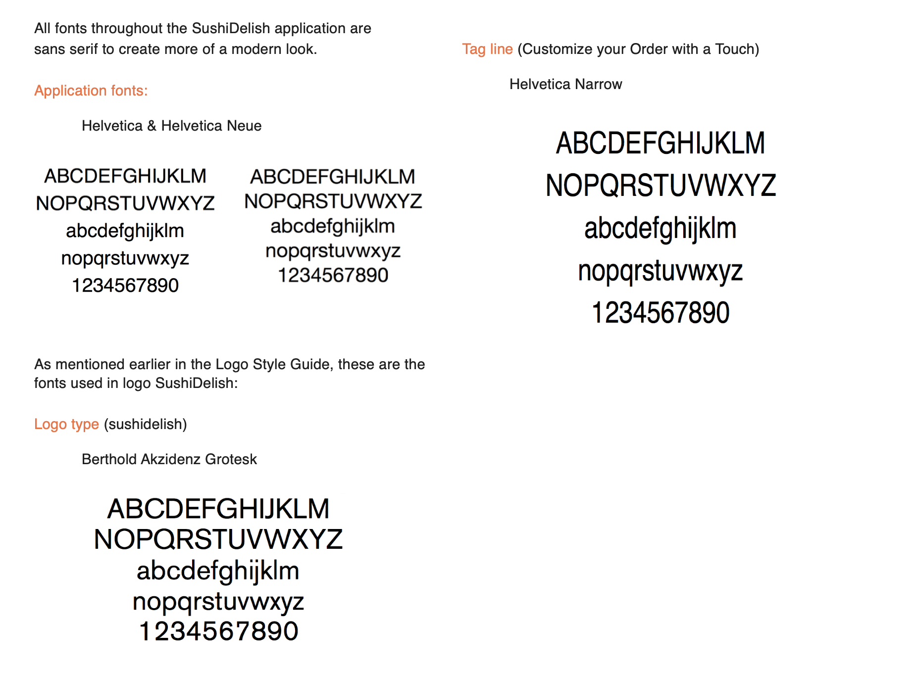
Typography
{ Mockups }
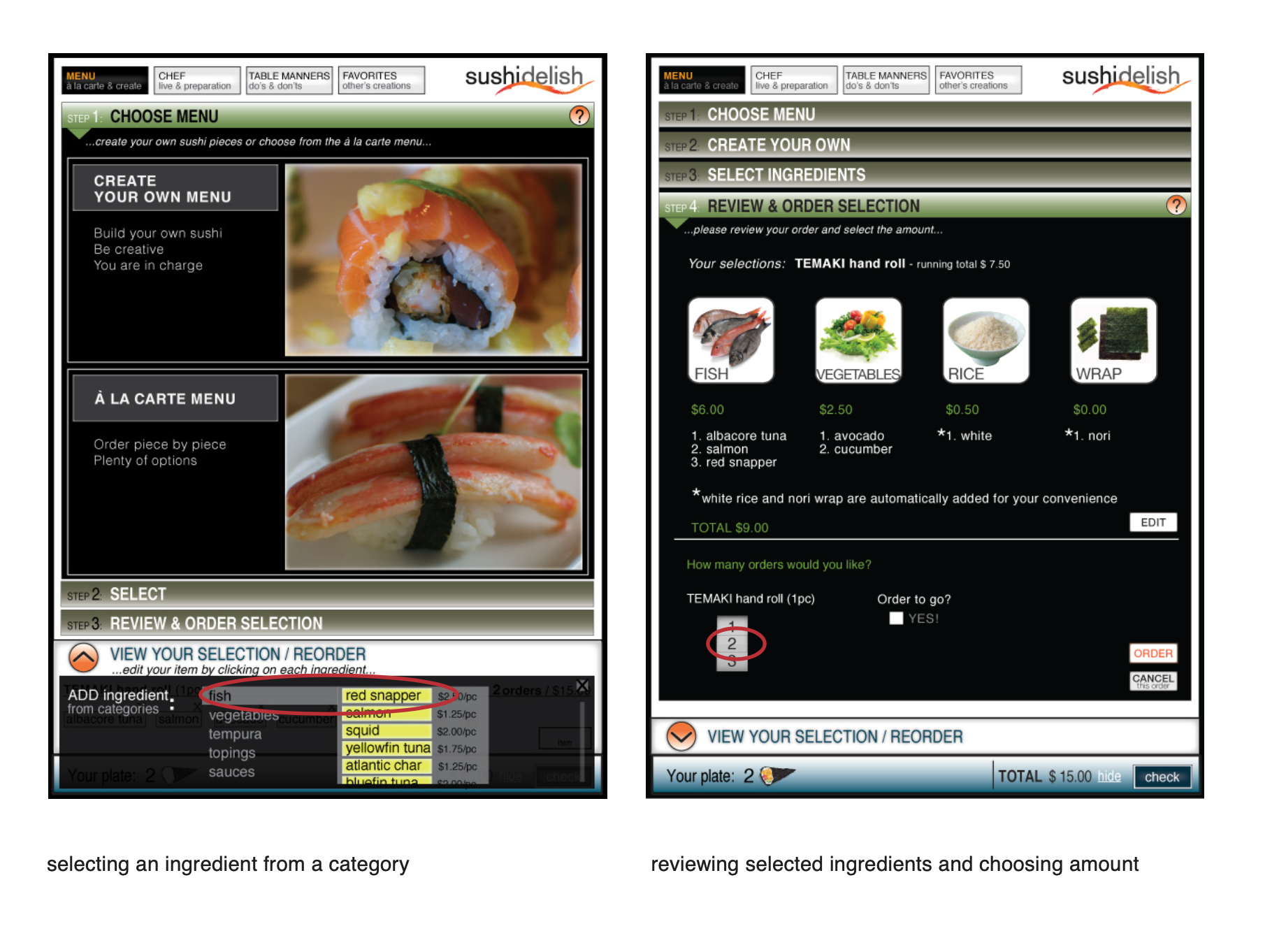
Initial Design
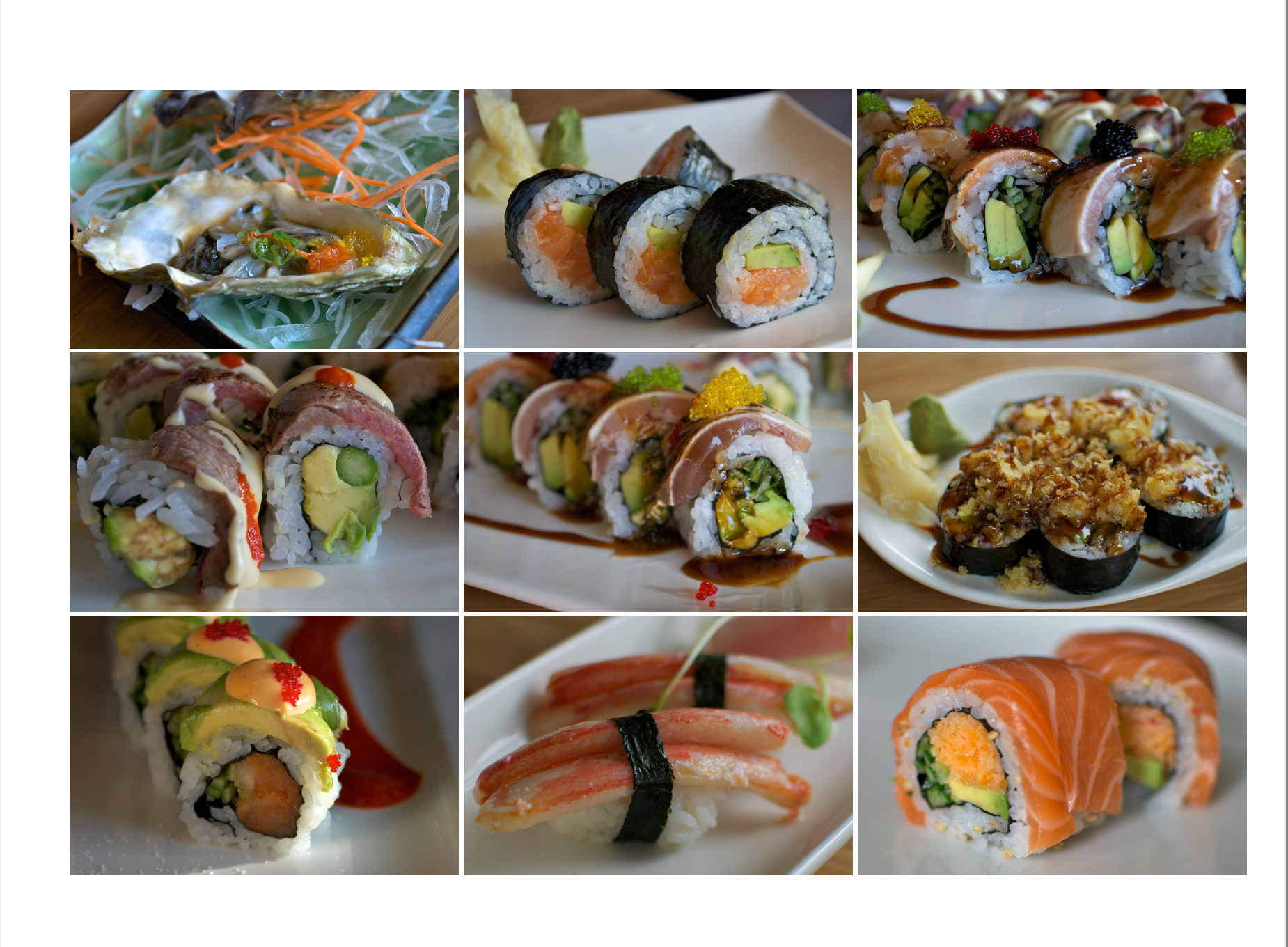
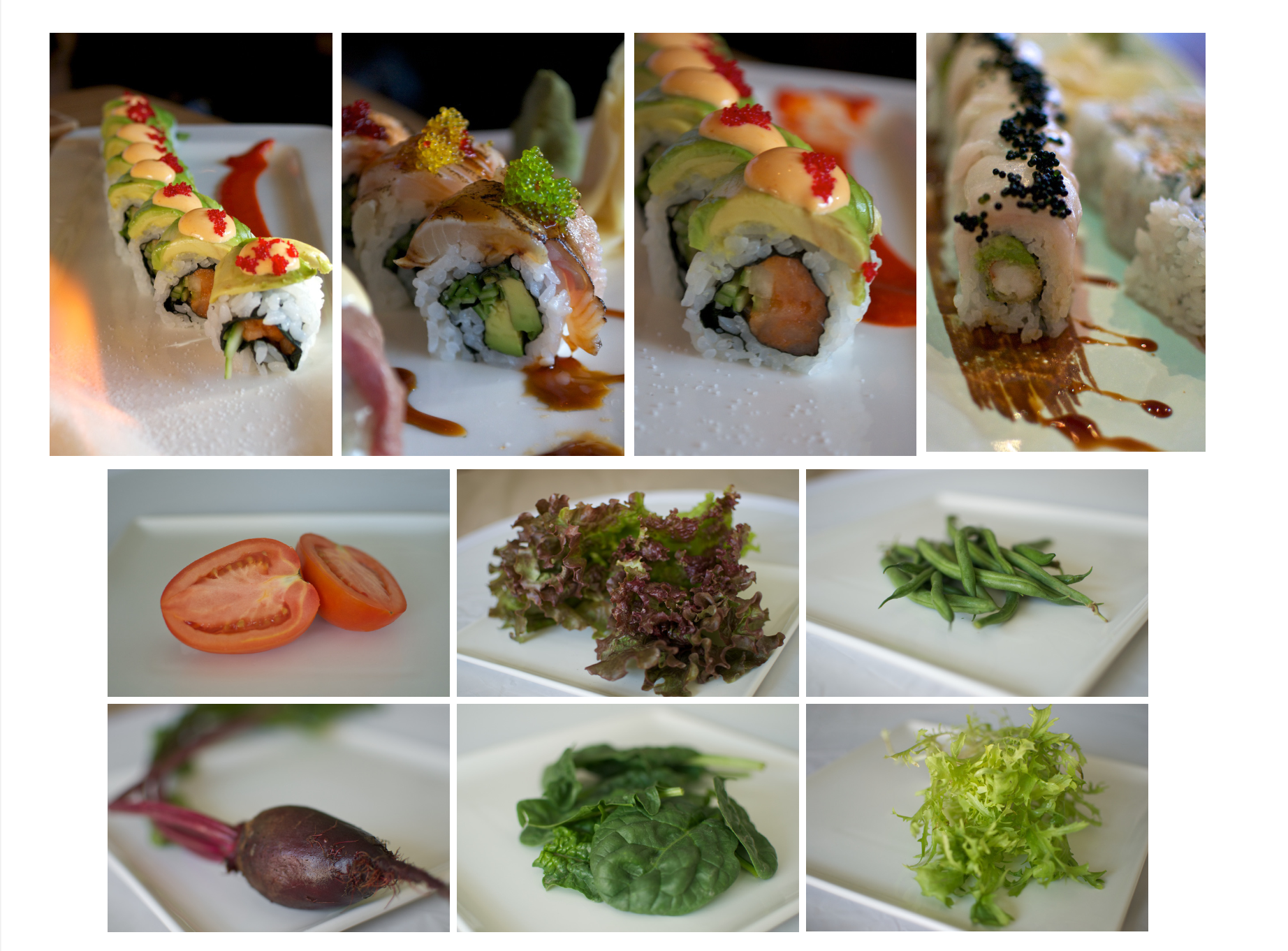
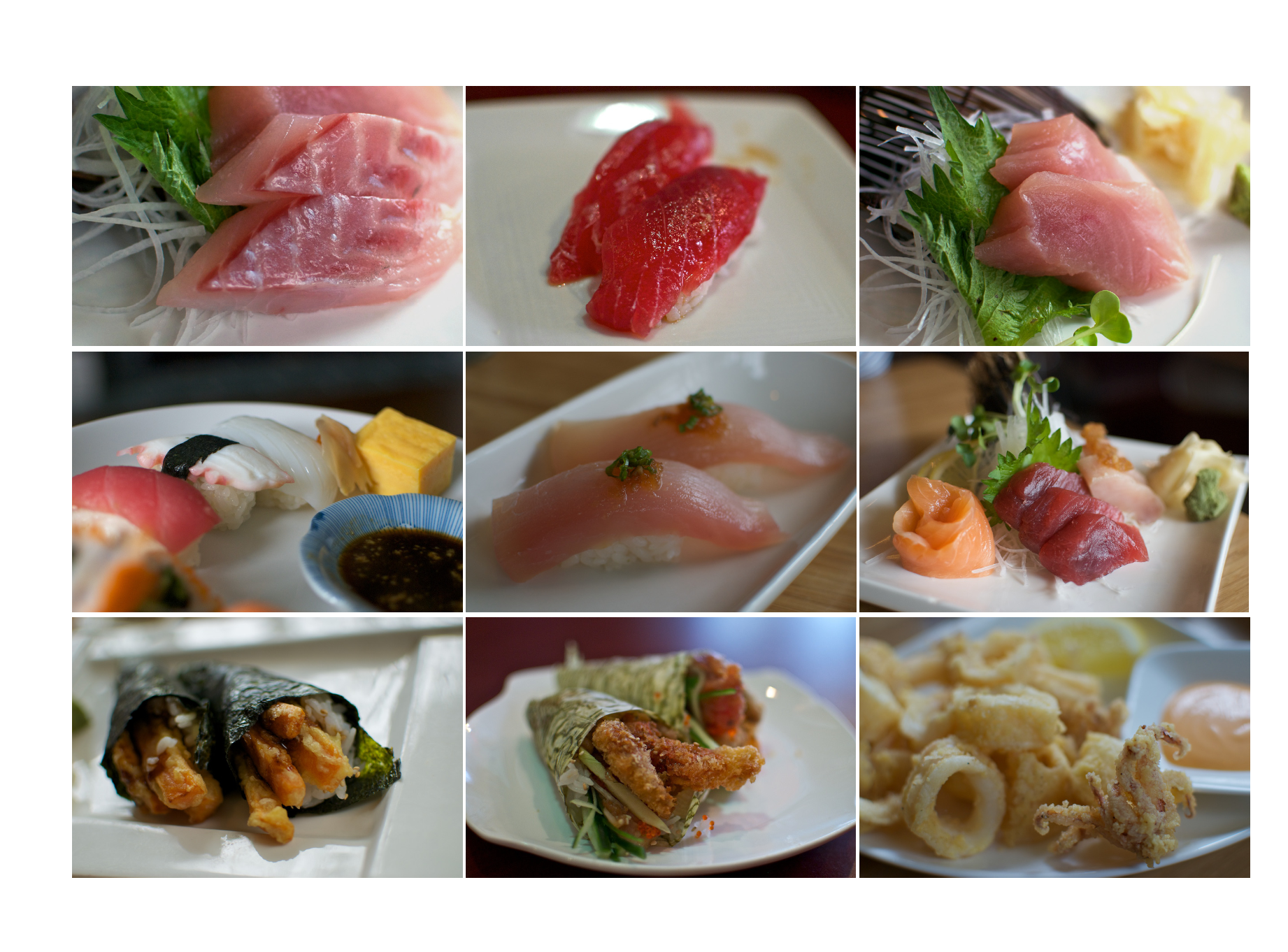
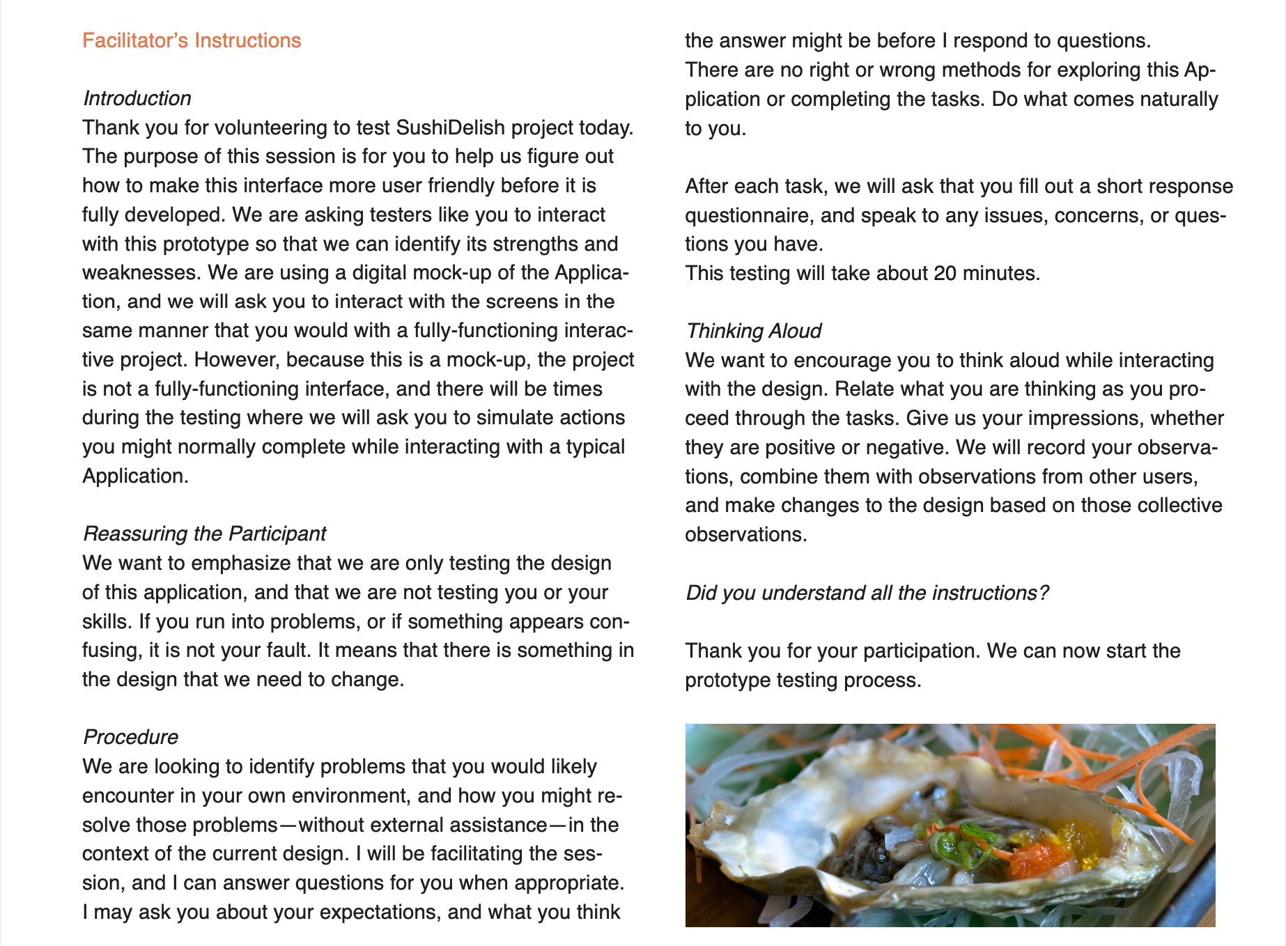
Photography :
Food Photography
Images
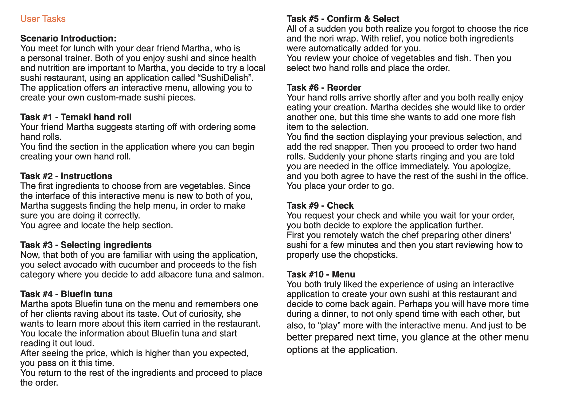
Usability Testing :
Instructions
Test Tasks
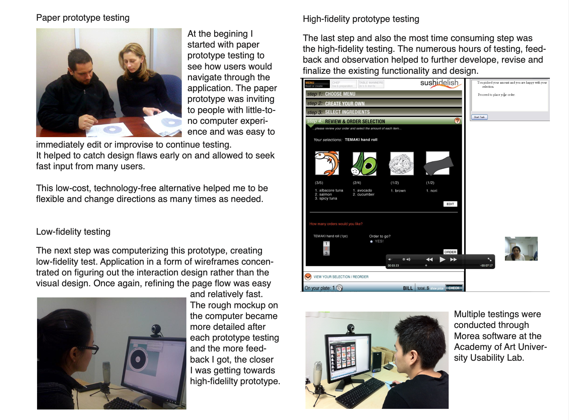
User Testing
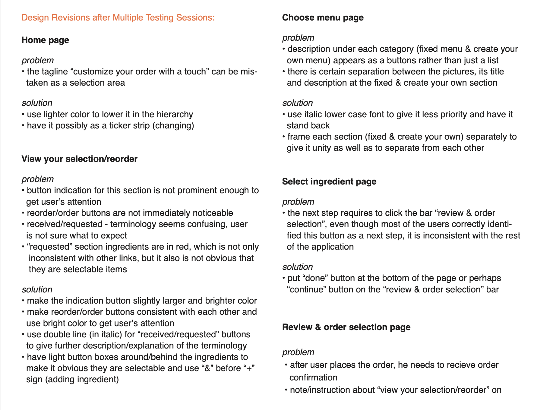
Design Revisions
